Founding Design for a B2B Startup
Macro
|
Product/Brand Design, B2B Software
|
2021
Product Hunt: producthunt.com/products/macro
In April 2020, I embraced the opportunity to join Macro, a startup building a no-code process management tool. I was driven by the adventure of creating a new product as their first employee.
As the founding designer, I was central to evolving Macro from an idea to its first launch, collaborating closely with the co-founders and engineers. My role was to spearhead everything that involved design, with the goal of releasing an MVP to find product-market fit. In this B2B SaaS startup, I focused on creating practical, scalable, and user-centered design solutions, ensuring they effectively met our users' needs.
Problem
Existing tools like Zapier automated certain workflows, yet many tasks still required human input, with no efficient management solutions available. Companies often used static documents on platforms like Google Docs for tasks that needed human intervention, lacking a unified system for documentation, assignment, tracking, and automation.
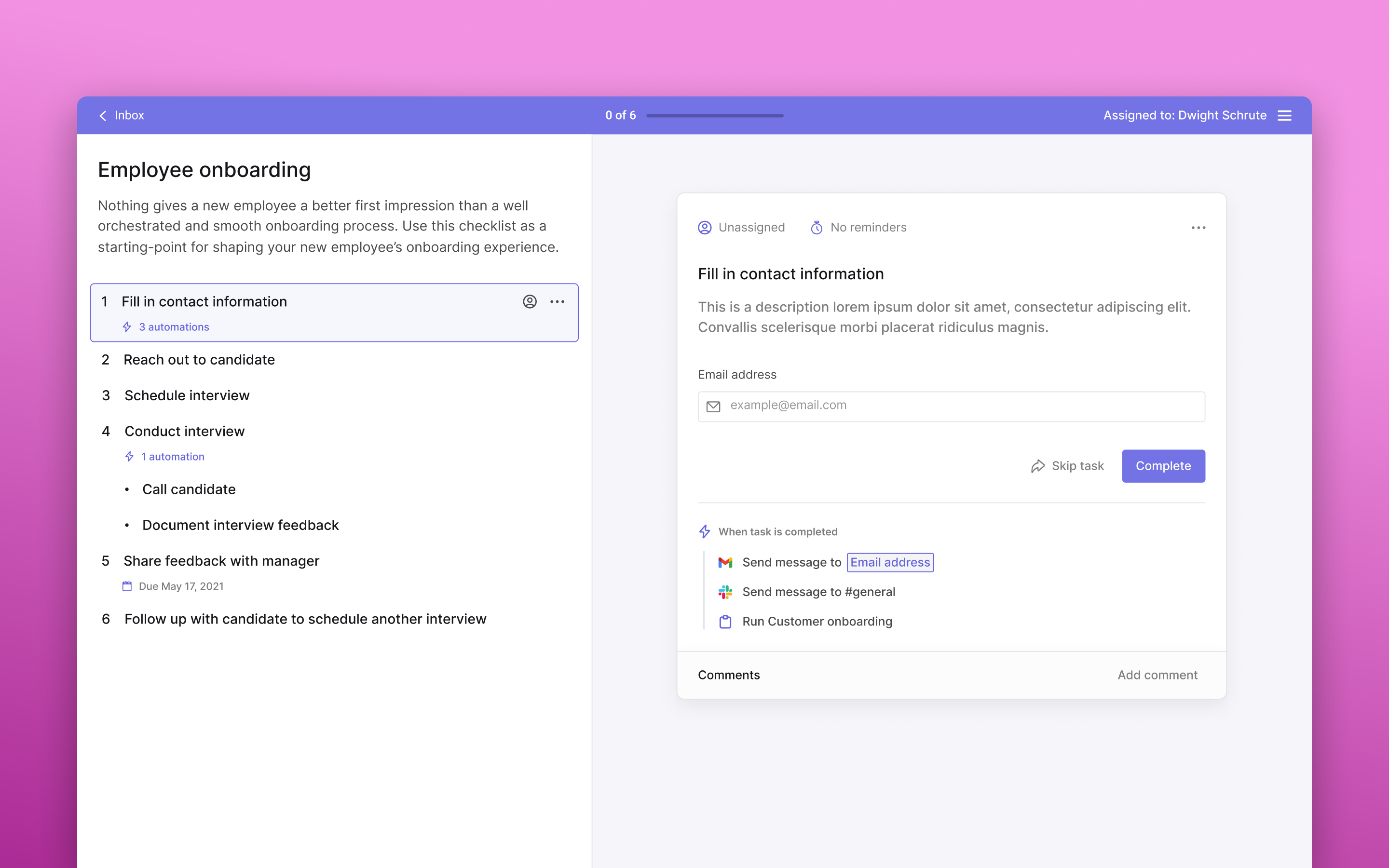
Checklist Runner - a collaborative checklist designed for team members to collectively complete tasks
Visualizing Workflows as a Dynamic Checklist
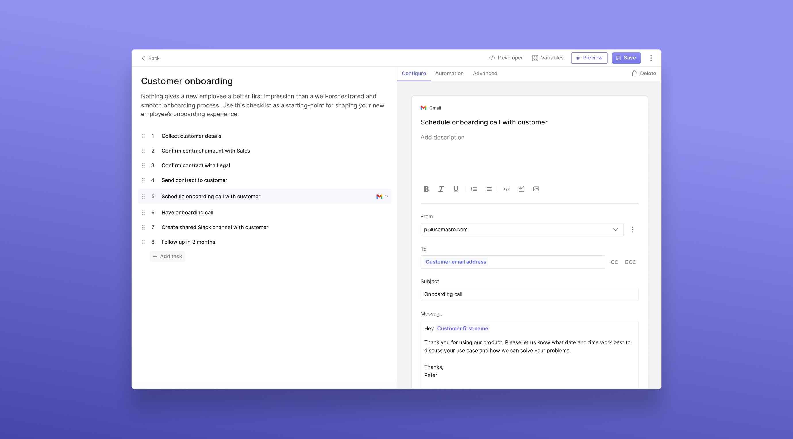
Macro provided a solution, allowing Operations teams to design, implement, and oversee custom workflows in a single place. Its two-pane checklist UI dynamically visualized workflows, simplifying task management and facilitating coordination and third-party application integration.
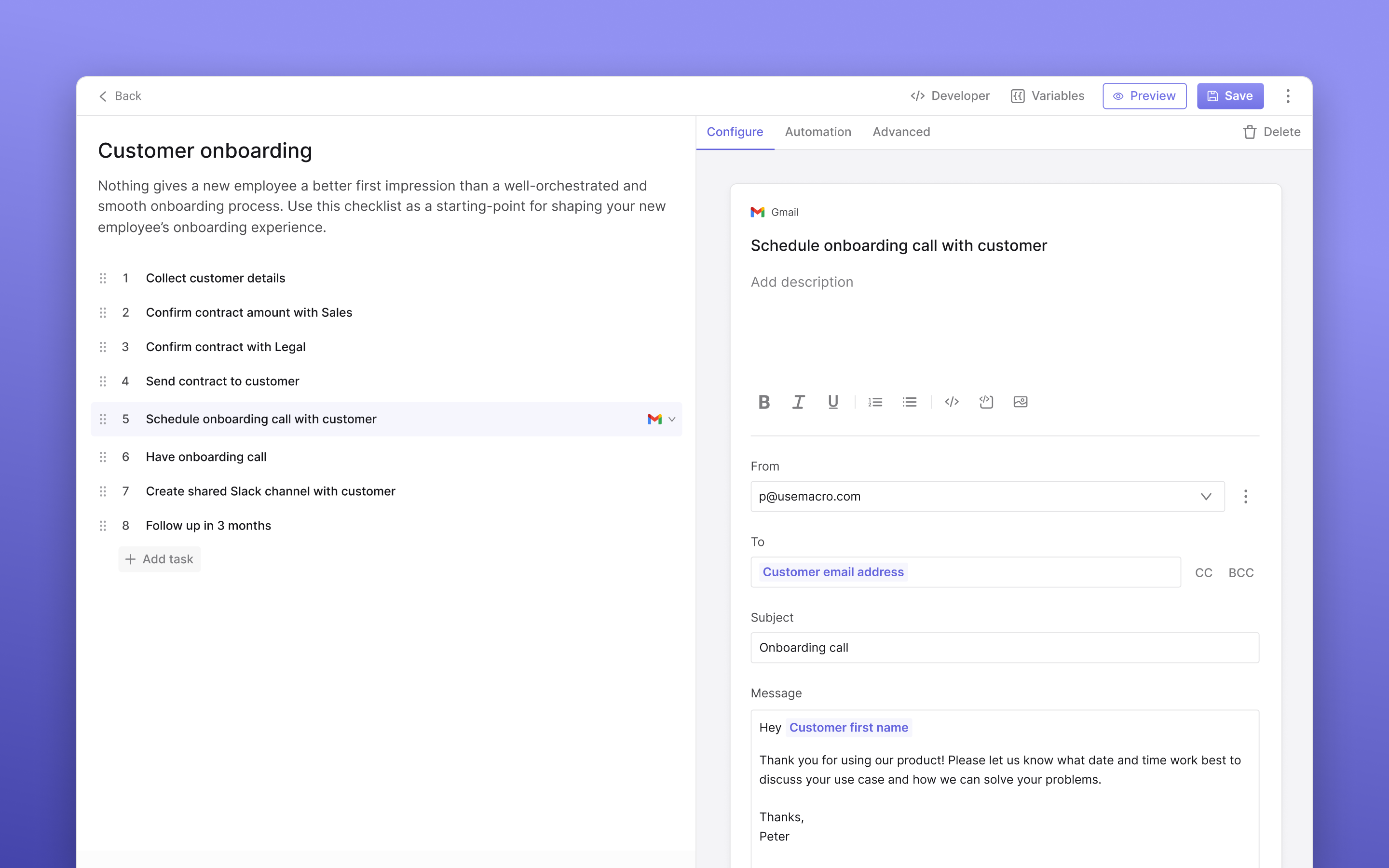
Checklist Editor - where teams create their operational workflows
The left pane enabled teams to visualize workflows in a checklist format, similar to familiar documentation tools. Tasks like form completion, file uploads, and sending templated emails were configured on the right pane, which enabled the coexistence of commonly used third-party apps and human tasks in a single place.
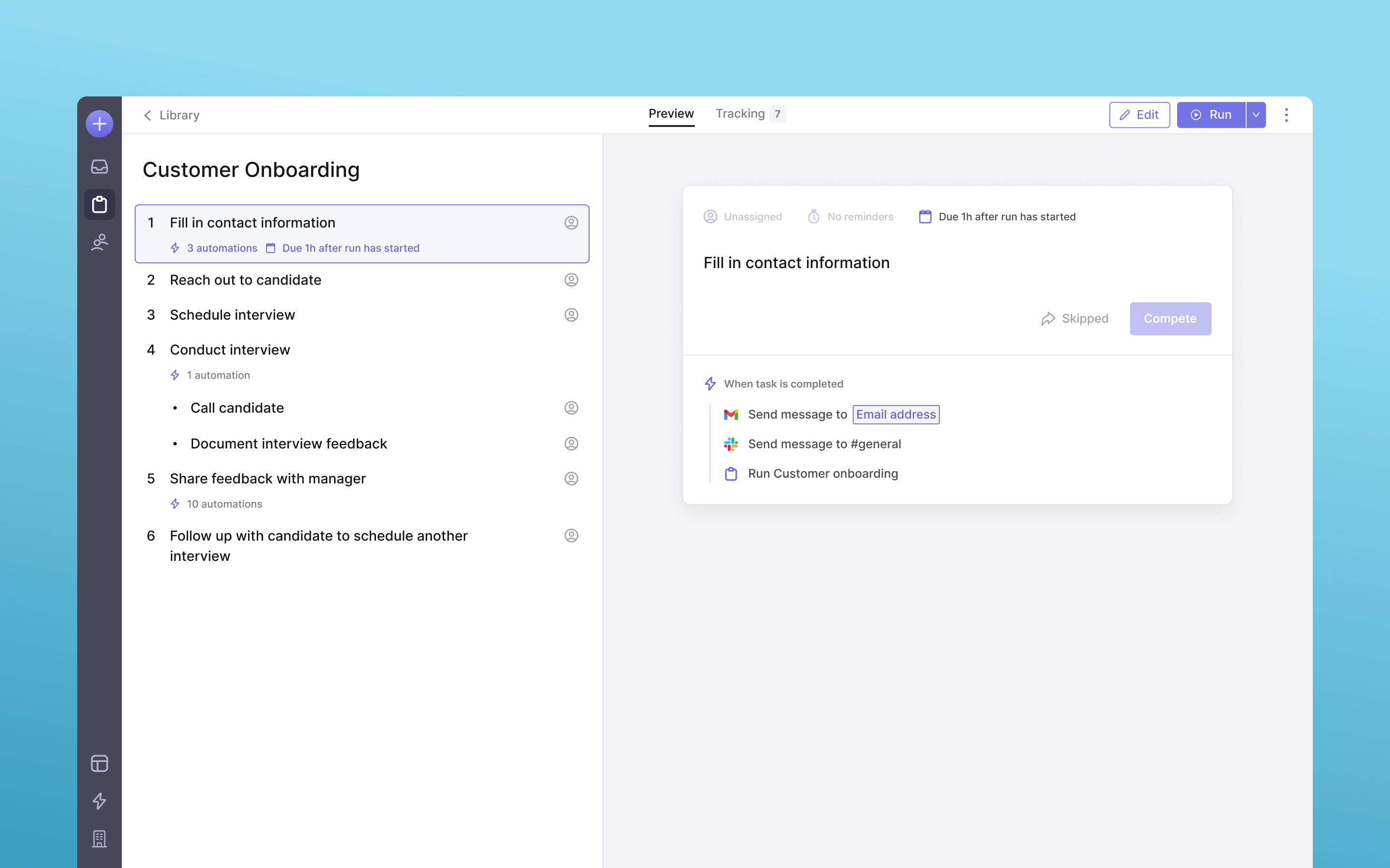
Checklist Preview - a comprehensive overview of the team's operational workflow
Tracking Processes
Given that Macro served as a process management tool, it was clear that teams required a method to monitor their processes. The challenge laid in determining the optimal location for this functionality and formulate the most effective way for teams to track progress at a glance.
Within each run, tracking a set of tasks was essential. After engaging with our users, it became apparent that the precise task a team member was working on was less critical than understanding the overall progress and identifying the individual directly responsible for the task. Consequently, I incorporated a progress bar for each run, alongside the most pertinent information in each column, to facilitate teams in effectively managing their work.
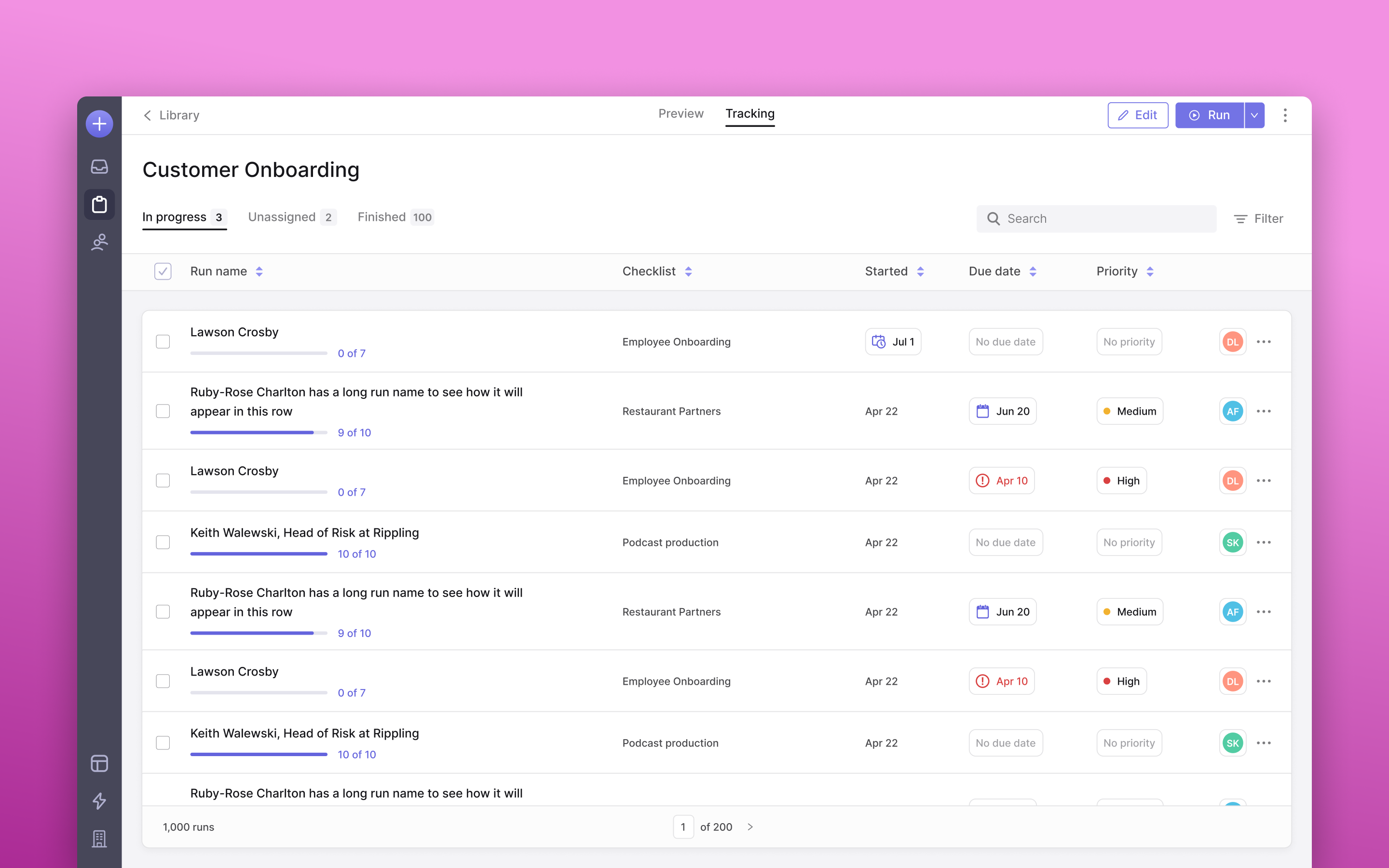
Tracking tab - placed inside Checklist Preview as a separate tab
Assigning Work
The Inbox represented one of the most significant design hurdles for Macro. Macro accommodated two kinds of task assignments: individual tasks and complete workflows. This setup introduced a nuanced distinction in user experience between managers and team members. While a member might be assigned specific tasks within a checklist, a manager or team lead could be tasked with overseeing the completion of an entire checklist.
Given these dynamics, it was crucial to make a clear distinction between a checklist and an individual task, yet still enable users to easily identify the work for which they were responsible. The Inbox served as a critical hub for members to understand their immediate responsibilities, thus necessitating a design that minimized cognitive load, allowing members to quickly and effortlessly grasp their tasks.
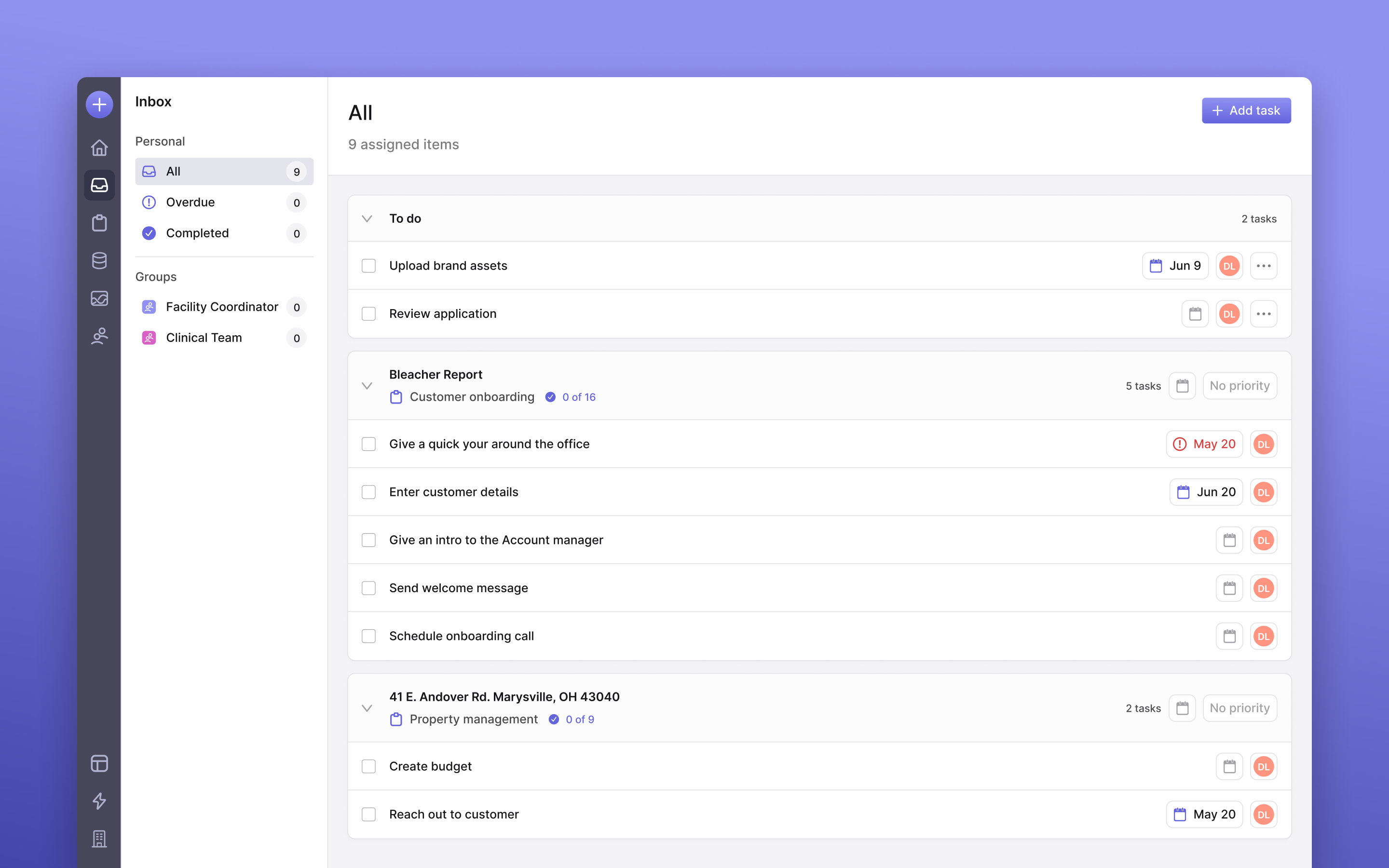
Inbox - all your tasks in a single place
The solution involved grouping all tasks under their respective checklist run and displaying only the tasks for which members were responsible. This approach allowed members to focus on their immediate tasks while providing the option to delve into the checklist for a comprehensive view if needed.
Logo Design
Designing the Macro logo was something I was super excited about. I view logos as deeply personal to founders because they encapsulate their vision and aspirations. With this philosophy in mind, I began by immersing myself in understanding what Macro meant to them. Their narrative and the careful consideration they had invested in the company served as a reference point throughout my process.
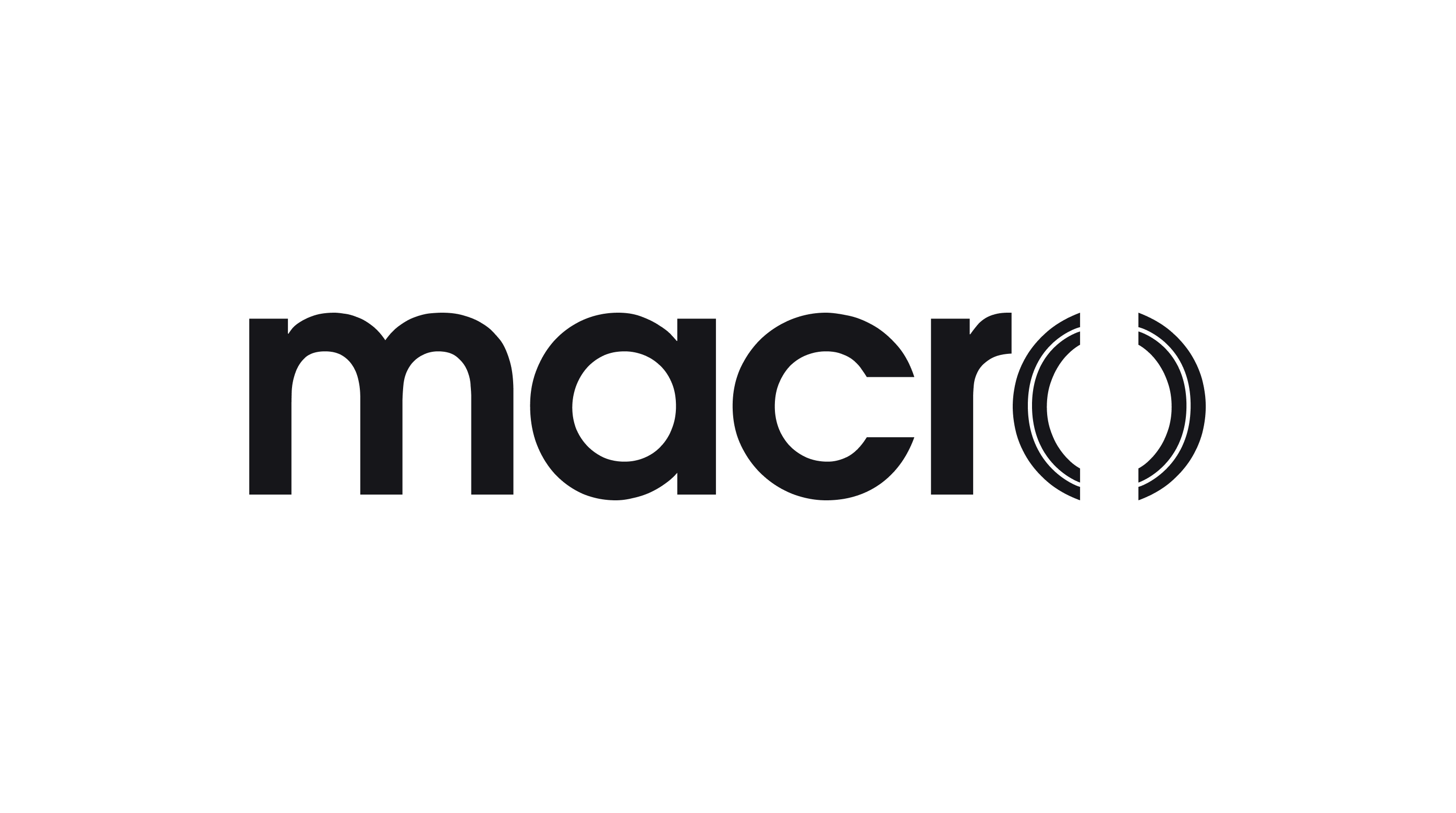
The logo embodies the future aspirations of Macro—the company, its product, and its team—rather than its current state. The ambition was to evolve into an accessible professional tool that fosters a more humane approach to interacting with technology.
In alignment with this ideology, I aimed for the logo to stand for modernity, durability, and familiarity. These qualities, I believed, were indicative of what an "accessible pro tool" should embody.
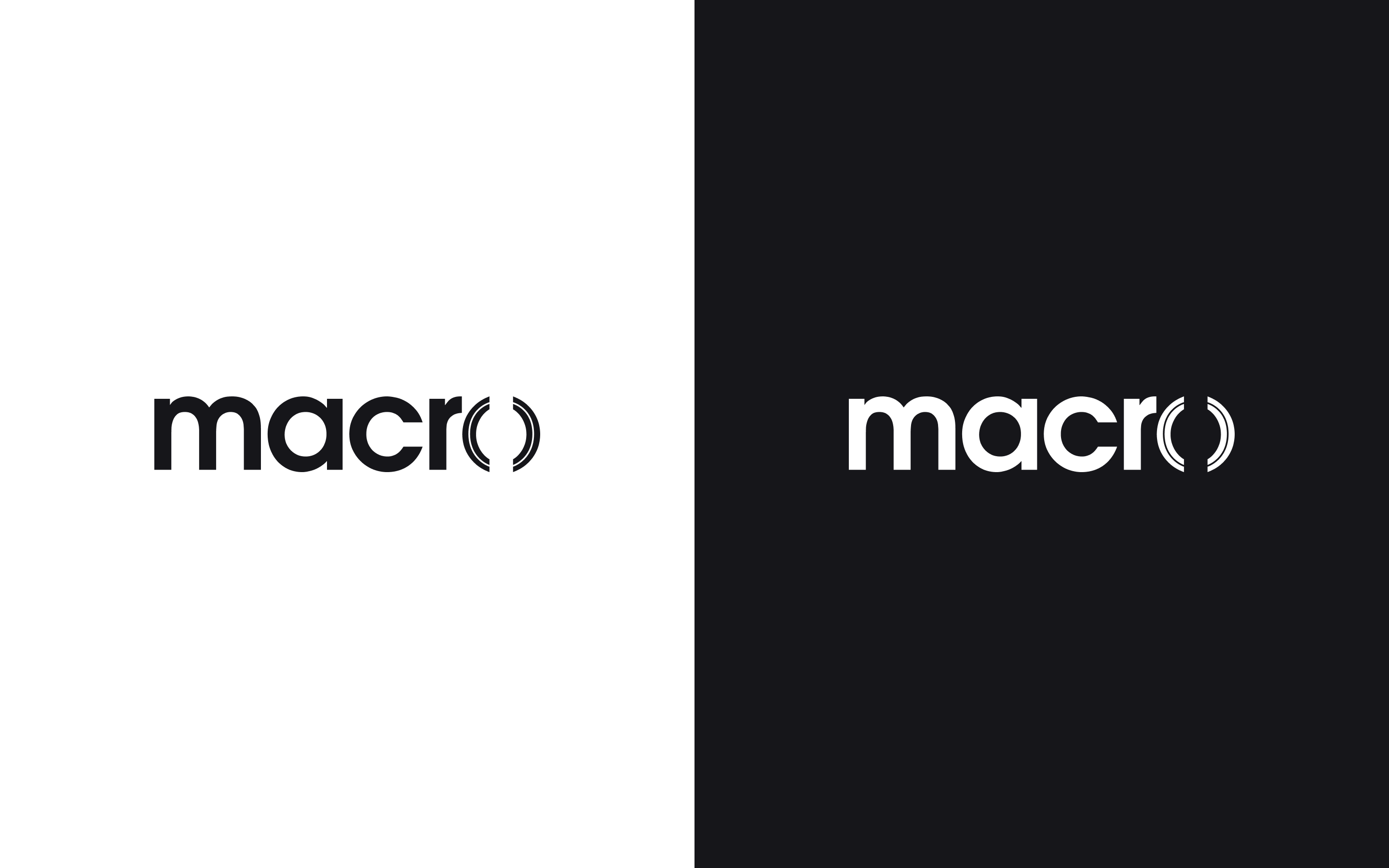
To achieve this, Avant Garde was chosen for the logotype, a typeface also utilized in the corporate logos of Adidas and as a principal font in Sony’s corporate marketing programs. This modernist typeface, prevalent among ubiquitous brands, was selected to convey boldness, progressiveness, and professionalism, reinforcing the intended perception of the logo.
