Redesigning Otter's Icon Library
Otter.ai
|
Product Design, Iconography
|
2022
Otter.ai is a company that specializes in voice transcription services, leveraging advanced AI technology to convert live speech into text in real-time. As a freelance designer, I had the opportunity to collaborate with Otter.ai's product team, bringing a fresh perspective to their design challenges.
Recognizing the need for refinement, I proposed a redesign of their icon library to the Design team. This project aimed to enhance the visual coherence and user experience of Otter.ai's UI.
Problems in the Original Design
The original design exhibited inconsistencies in size and border width, leading to technical challenges during the implementation of icons in the UI.
Even though the icons were designed in an outline style, they lacked cohesion due to missing distinct characteristics that should unify all the icons. Functionally, the icons presented several issues - they were too thin and difficult to discern against a dark background, had inconsistent proportions making them appear as though they were in different sizes, and featured inconsistent specifications in the Figma file, which required ad-hoc adjustments.
Before: the original icons had inconsistent proportions
Preserving the Quirks
The original icons were characterized by their simplicity, modernity, friendliness, and occasional quirkiness. Each was distilled to its minimal form, capturing only the essential characteristics. My goal was to adhere to these principles while enhancing their functionality.
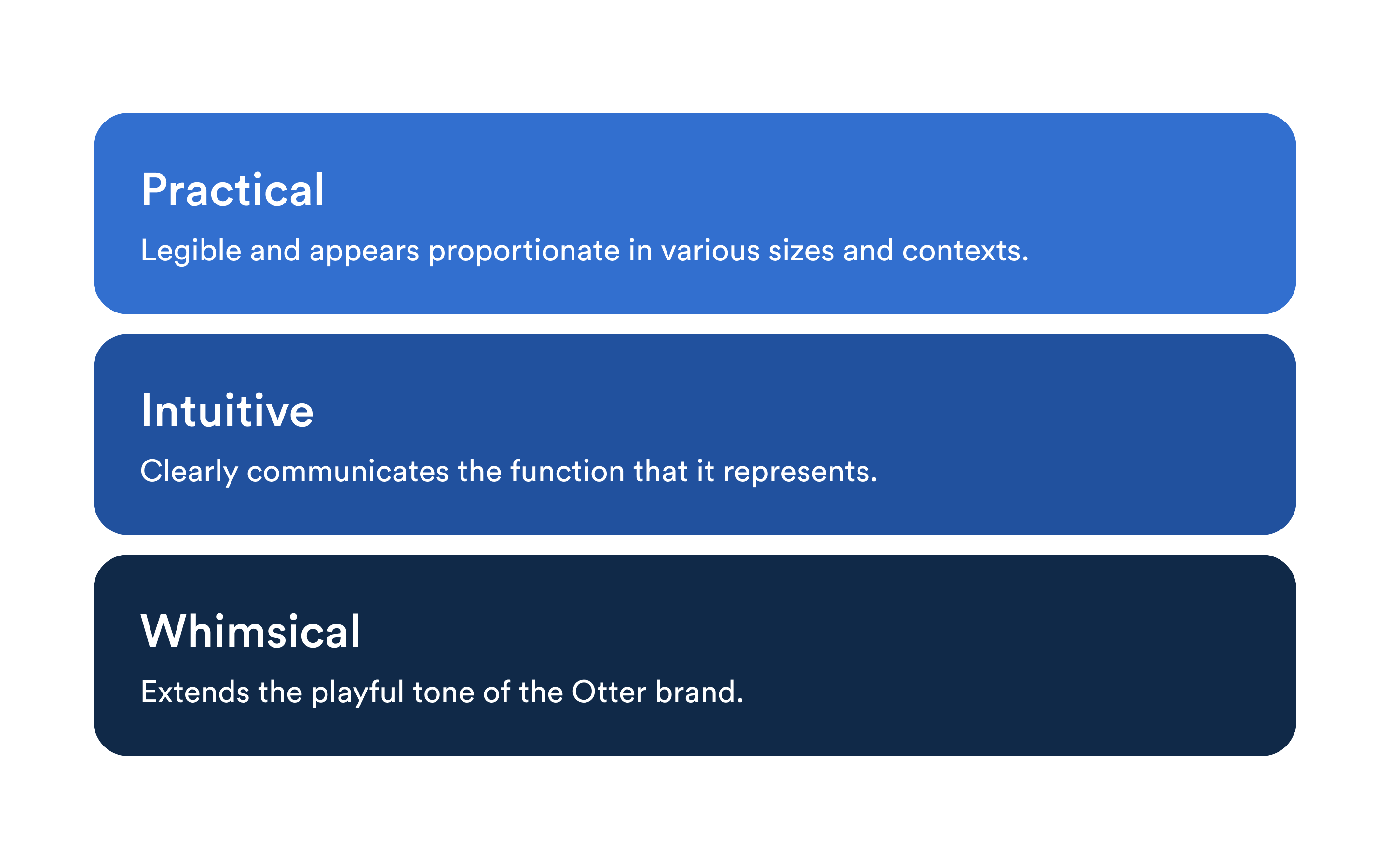
In embracing the redesign, the new icons had to balance aesthetics with practicality, ensuring legibility and ease of implementation. Considering the product's design language and existing issues, the objective became to create an icon library uniquely tailored to Otter, one that is practical, intuitive, and whimsical.
Design principles
Introducing an Element of Recognition
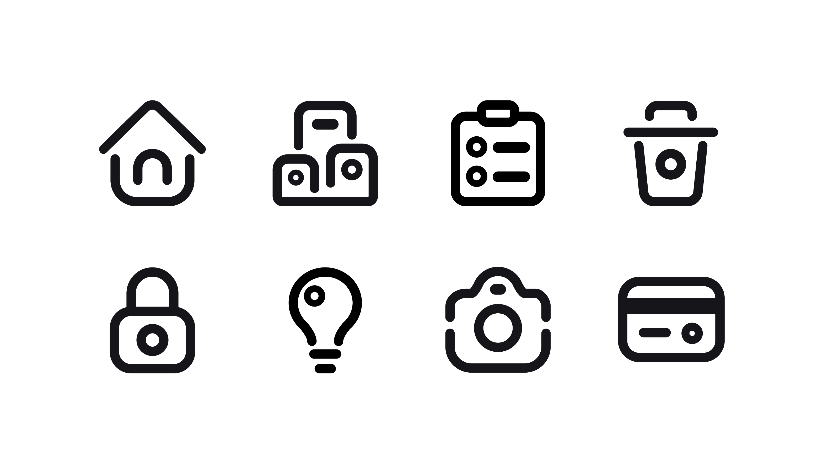
The visual approach was to "Subtract and Underline." I aimed to strip back each icon to its essential form, removing unnecessary elements to achieve simplicity. At the same time, I introduced a unique feature to each icon, hence underlining, to create an element of recognition (e.g. adding a circle in the trash icon as a nod to the Otter brand). This approach sought to balance minimalistic aesthetics with distinctive identity.
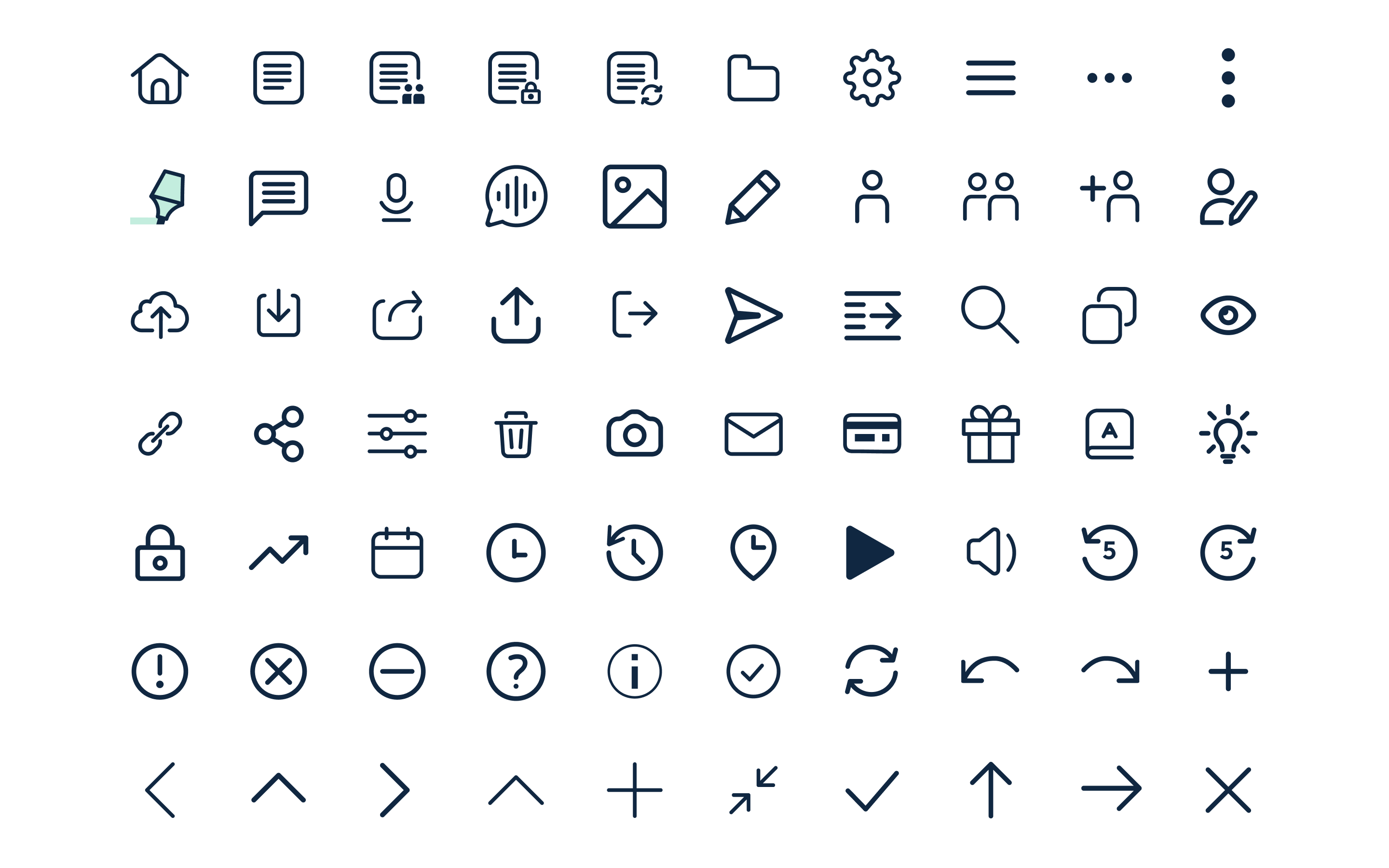
New Iconography
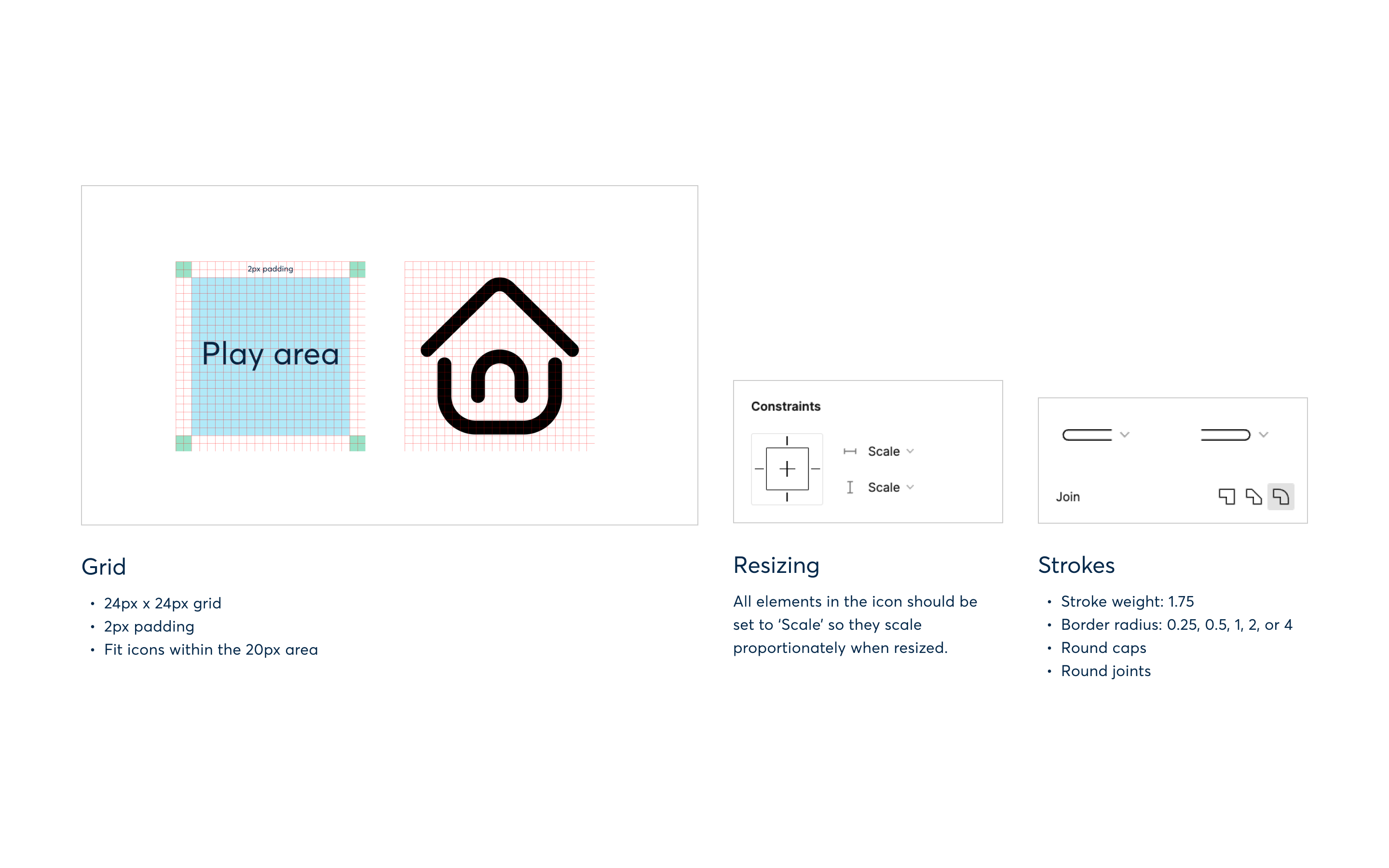
Guideline
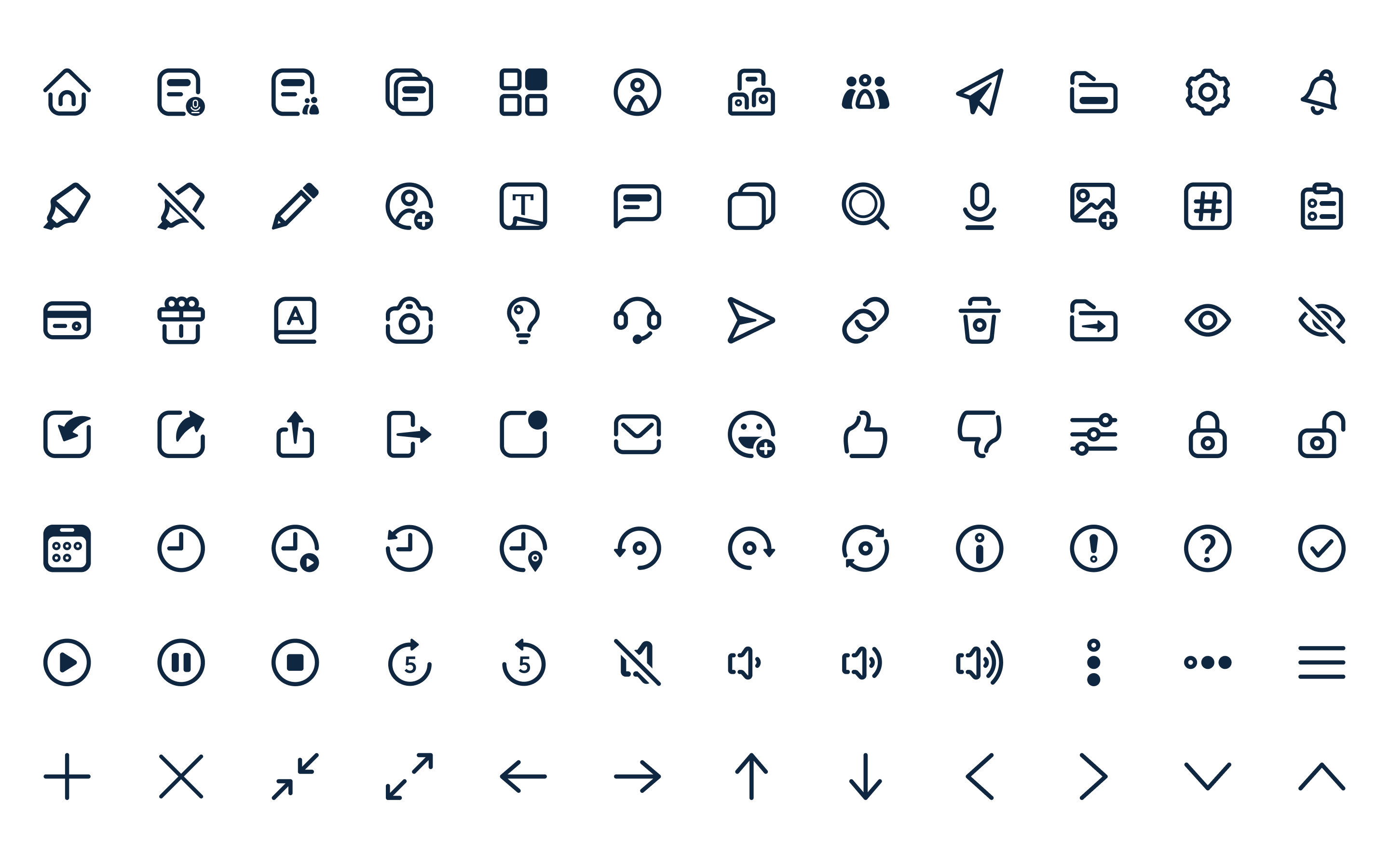
The icons were designed within a 24px by 24px grid, incorporating a 2px padding around each to ensure uniformity and provide visual 'breathing space.' The stroke weight was set to 1.75px, a choice that balances visibility on dark backgrounds with a soft, approachable appearance at smaller sizes. Round caps and joints were used to emphasize the design's friendly aspect further. To ensure scalability across various sizes without losing proportion, all icons were converted into flat vectors.
Guidelines