Design Direction for Global Expansion
NOT A HOTEL
|
Brand Strategy, Design Direction
|
2024
Background
NOT A HOTEL is a Japan-based company that partners with the world’s top architectural and design talent to create a new type of luxury vacation home. Homes are located in scenic areas throughout Japan and are available for shared ownership.
After the co-ownership service took off in Japan amongst its domestic audience, the next step for growth was to market to a global audience. In close collaboration with NOT A HOTEL’s leadership, Takram led the charge in repositioning the brand for a global audience and developing a new website that reflected this ambition.
Defining an Overseas Audience
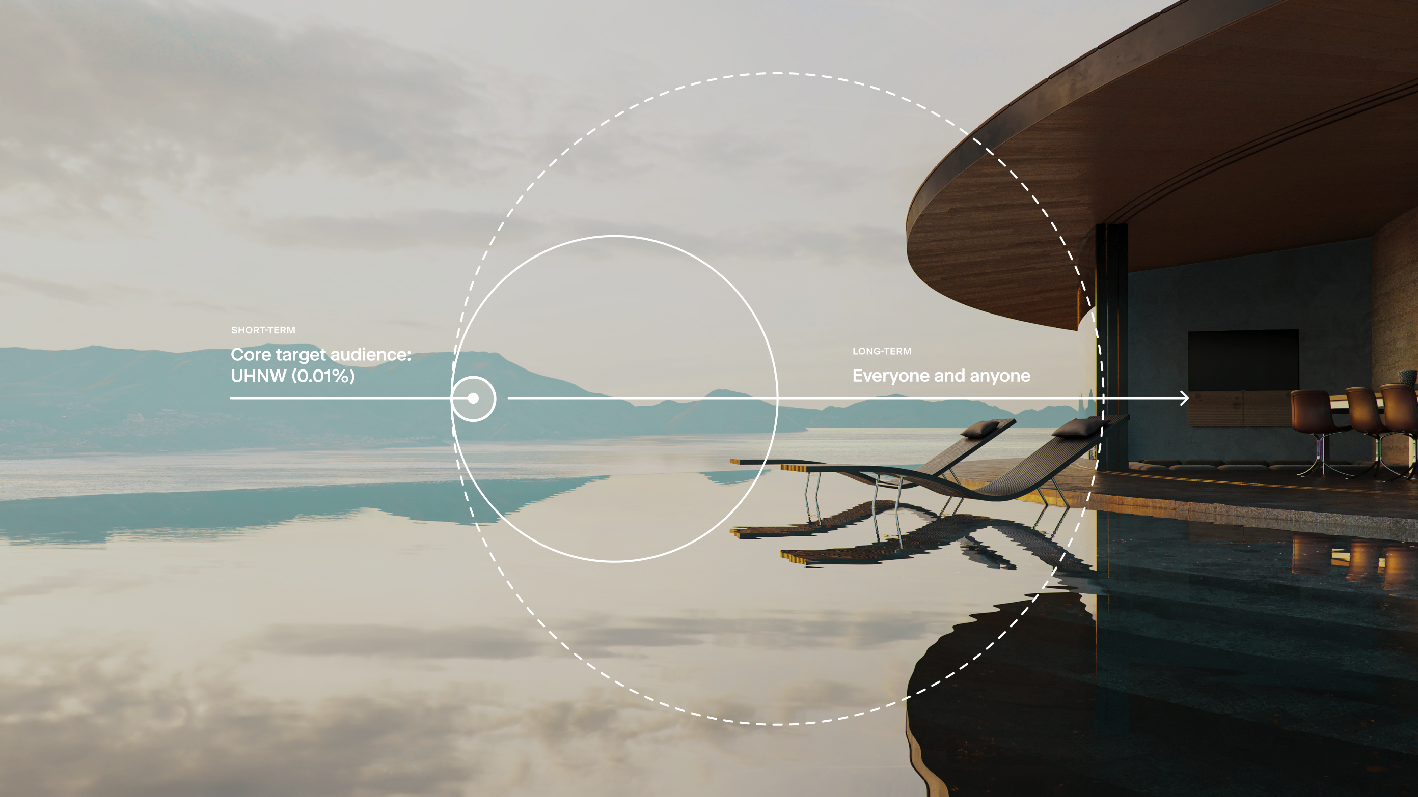
With the U.S. market being NOT A HOTEL’s North Star for global expansion, we first defined a target persona to guide our brand repositioning. Given the financial commitment of buying a luxury property overseas, we decided to target ultra-high-net-worth individuals as the most viable point for entry.
Within that demographic, we identified a niche group whose interests revolve around “Japanese culture”, “new luxury”, and “High Art”– collectors and investors, cultural tastemakers, Japan enthusiasts, and art devotees who seek creative inspiration in their daily lives and have an appreciation for rare, one-of-a-kind experiences and products.
Clarifying Value and Shaping Identity
Based on the needs of our newly defined target audience, we uncovered a brand idea called “Inspire Living”, which encapsulates NOT A HOTEL’s commitment to providing architectural excellence, as well as inspiring owners to imagine new and unconventional ways of living.
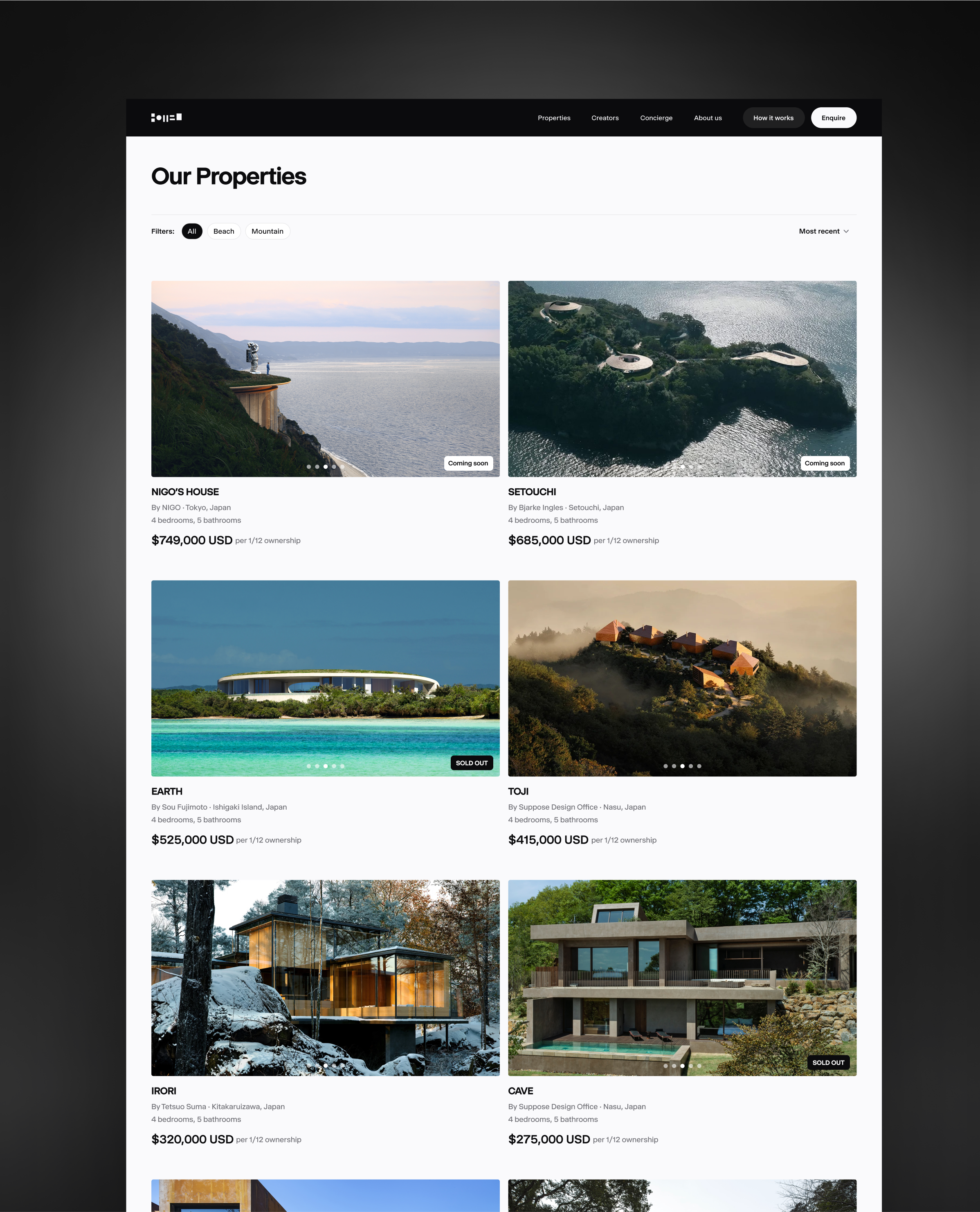
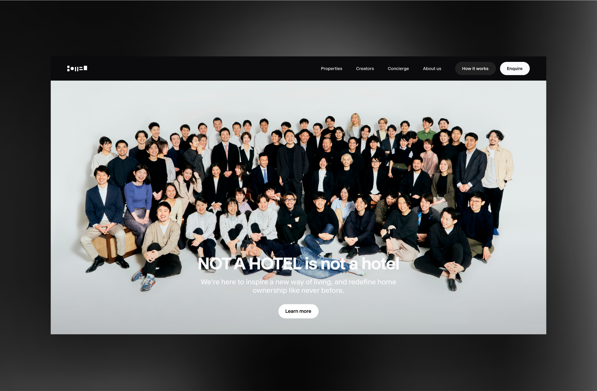
Given their unique business model, it was crucial that we articulate benefits for owners in clear and digestible forms, highlighting key values such as “flexible ownership”, “multi-locational living”, and “personal concierge” services. We also took care in building trust and credibility as an overseas entity, including crafting an “About Us” narrative that provides insights into the company, as well as bringing the creators behind the properties and their stories to the forefront.
Forging a Bold New Look
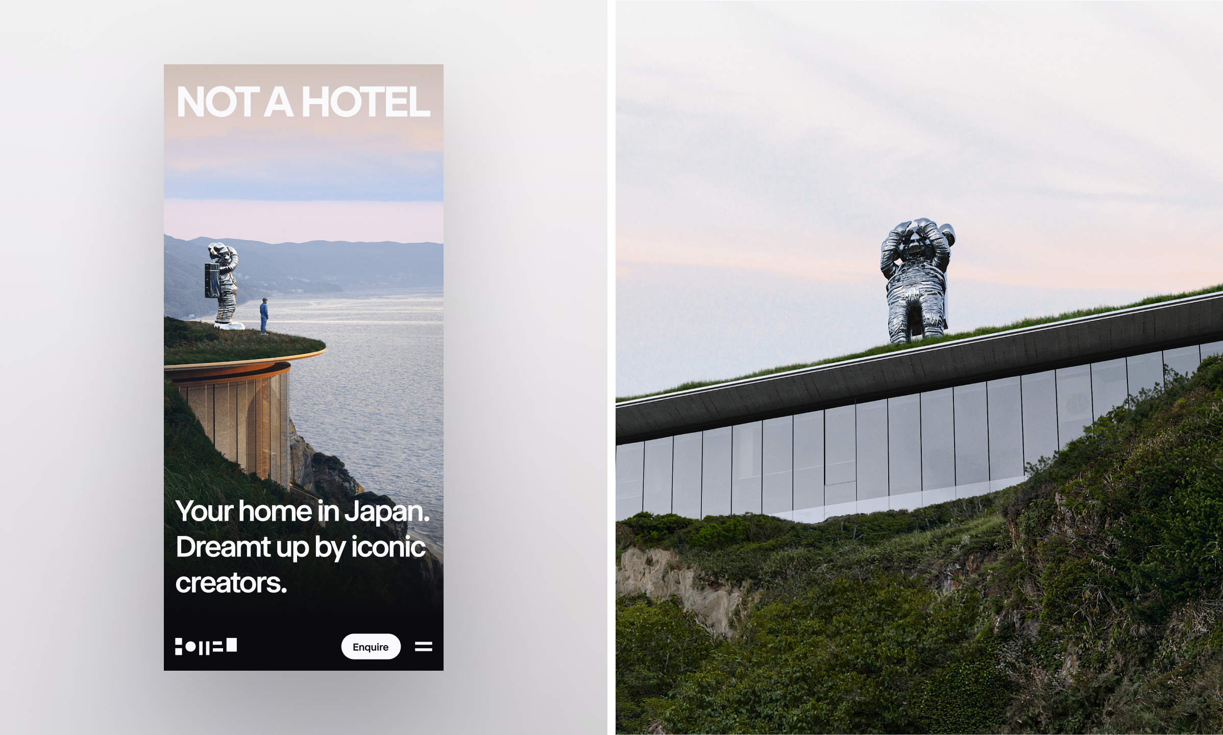
The leadership team initially favored the existing understated, modern aesthetic as a starting point. However, this approach felt incomplete, lacking a distinct identity and failing to effectively convey the brand’s core values.
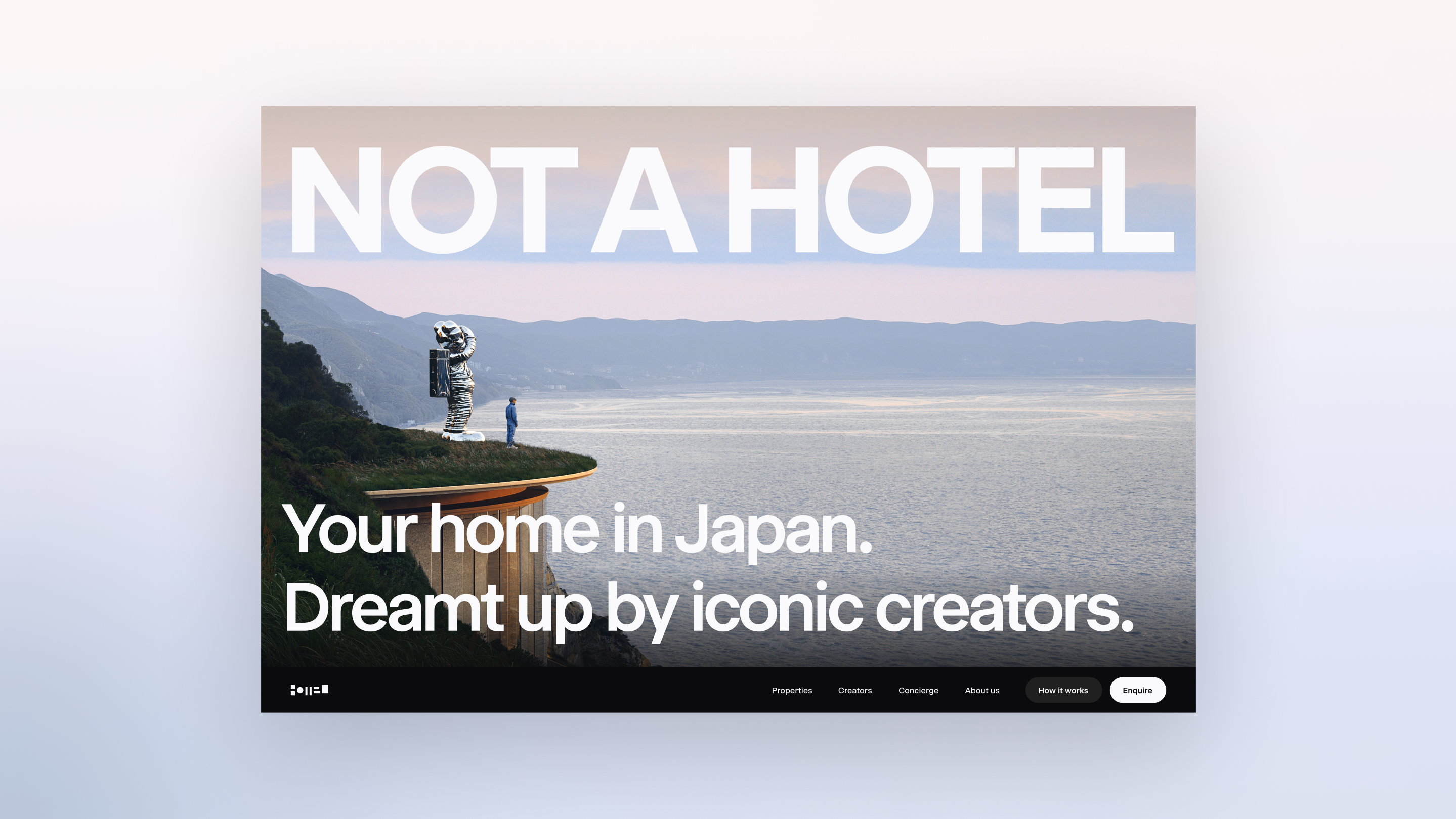
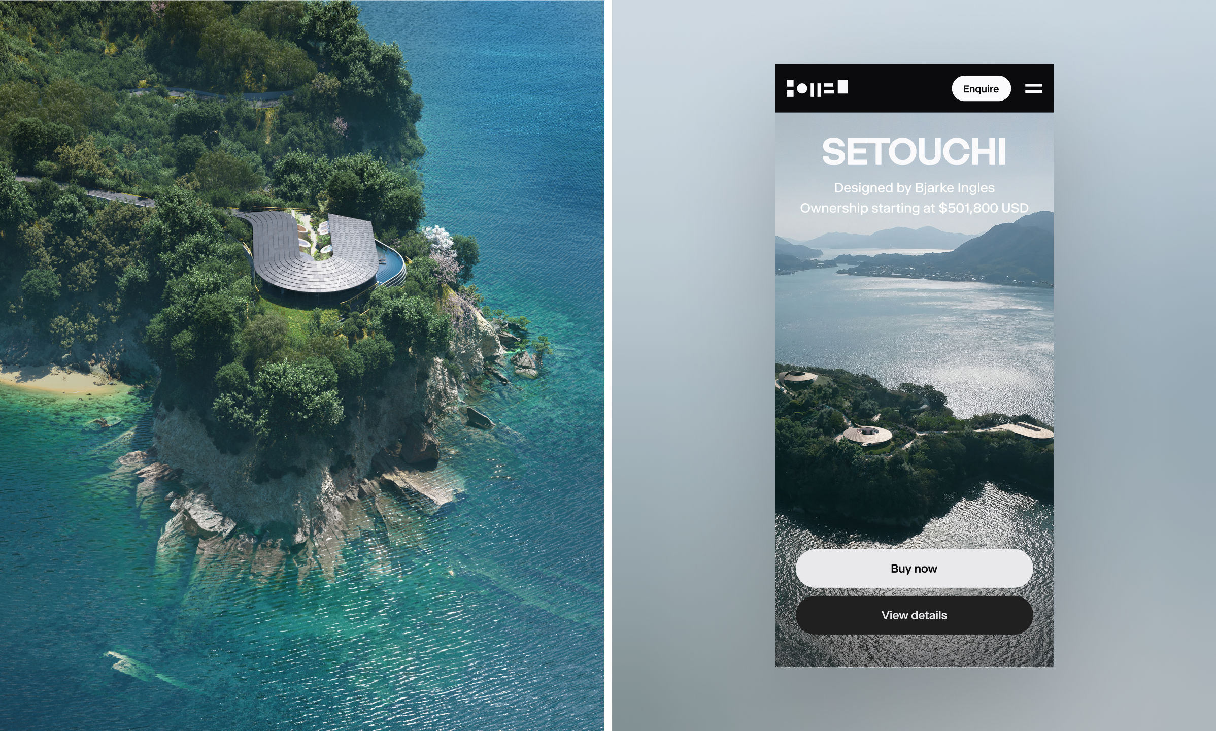
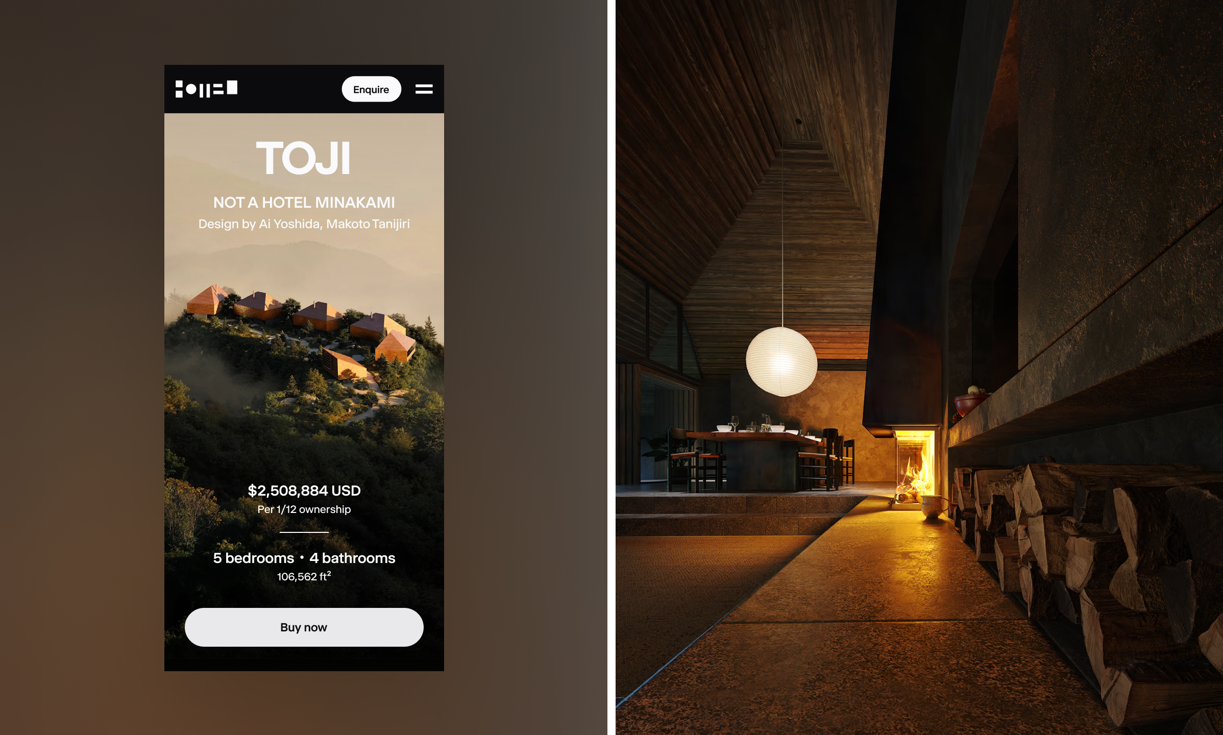
The new design infuses the original concept with the bold, avant-garde attitude that emerged during our conversations with leadership. The result is a more refined and daring identity, characterized by large imagery and bold typography.
A Transportive Web Experience
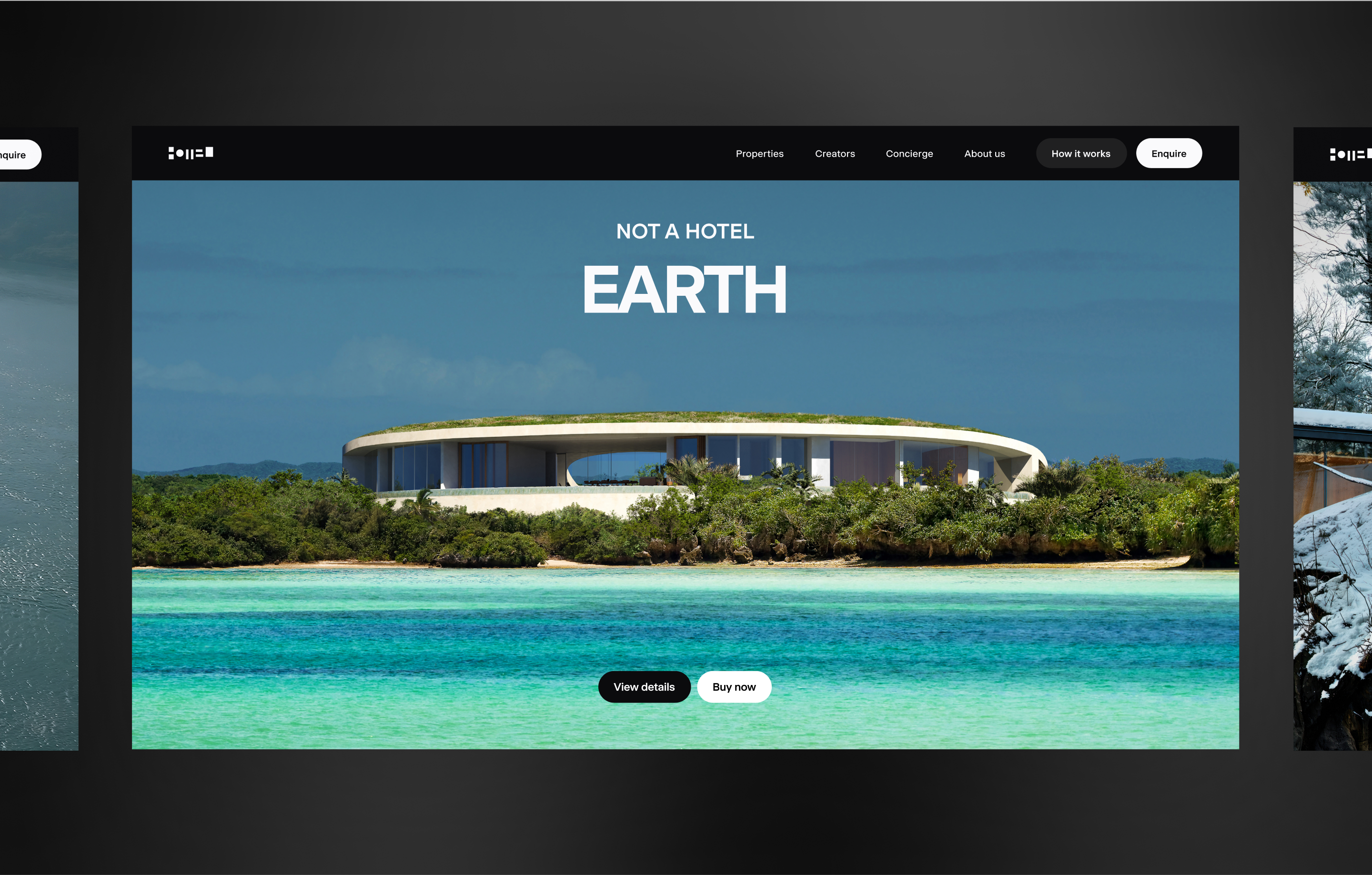
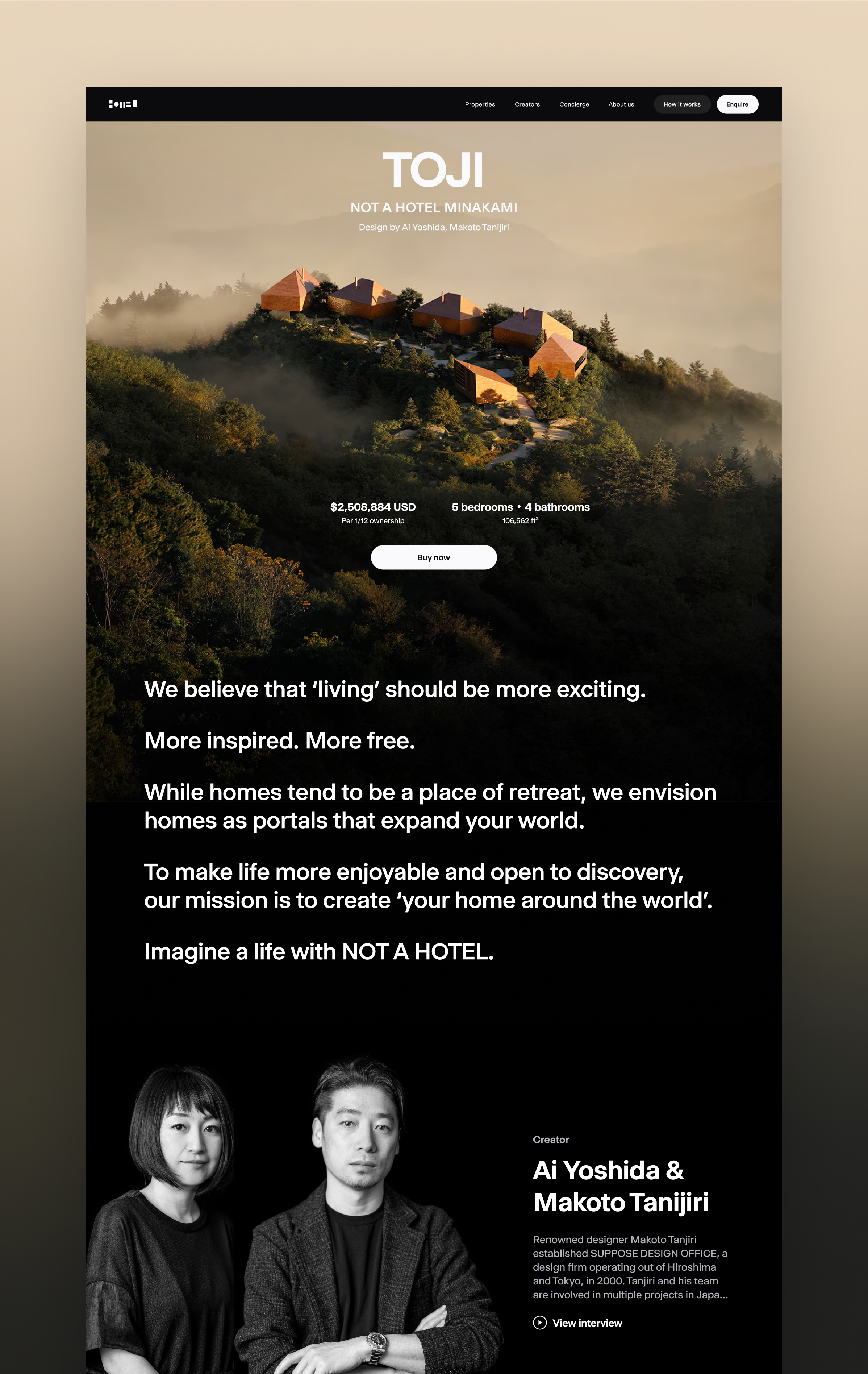
With the goal to wow and inspire prospective buyers, we aimed to create an immersive web experience that uniquely showcases the beauty and visionary spirit of NOT A HOTEL properties directly on customers' screens. The use of large, heroic imagery aims to transport the viewer to their dream homes, while the dramatic portraits of creators seeks to elevate their presence.
In doing so, our focus was to transform the often stressful home-buying process into an exciting experience, similar to discovering and buying a piece of art. Through intuitive information architecture and optimized user flow, we enhanced the ease of purchase by giving users the ability to browse seamlessly, find personal assistance at the right moments, and making the entire experience more thrilling and engaging.
