Updating the Family Operating System
Trustworthy
|
Product Design, Design System, Web/iOS App
|
2023

Trustworthy serves as the Family Operating System® designed to keep families organized and prepared, all in one place.
As a senior designer, my responsibilities encompassed enhancing all aspects of the product, including the web app, iOS app, and the design system. Trustworthy posed challenges in system-level problem-solving, given that many features and components were distributed across various platforms.
Partner Portal (New Platform)
The Partner Portal represents Trustworthy’s B2B2C initiative, designed to engage third-party partners, like wealth advisors, by providing them with a platform to meet their clients' needs.
Within a challenging timeframe of one week, I completed the MVP design. This rapid delivery was crucial for the business development team, enabling them to present a functional proof of concept to potential partners and thereby secure customers on a larger scale.
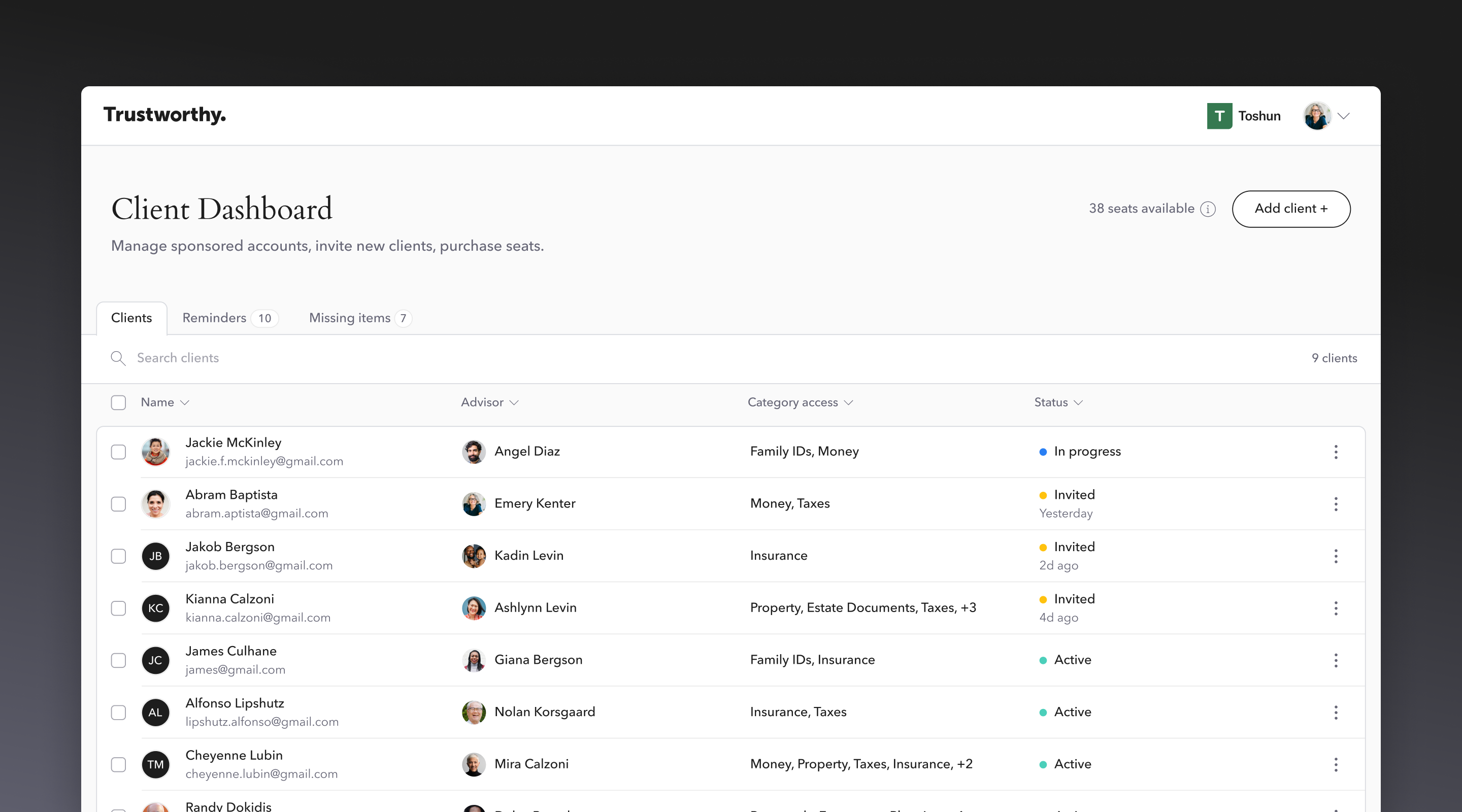
MVP design of the Partner Portal
Contacts (New Product)
There was no dedicated space for customers to save key individuals in their lives and link them to relevant assets. To address this, I introduced 'Contacts' as a new item in the main navigation. This addition enabled customers to easily access, view, and manage trusted professionals outside of their family circle.
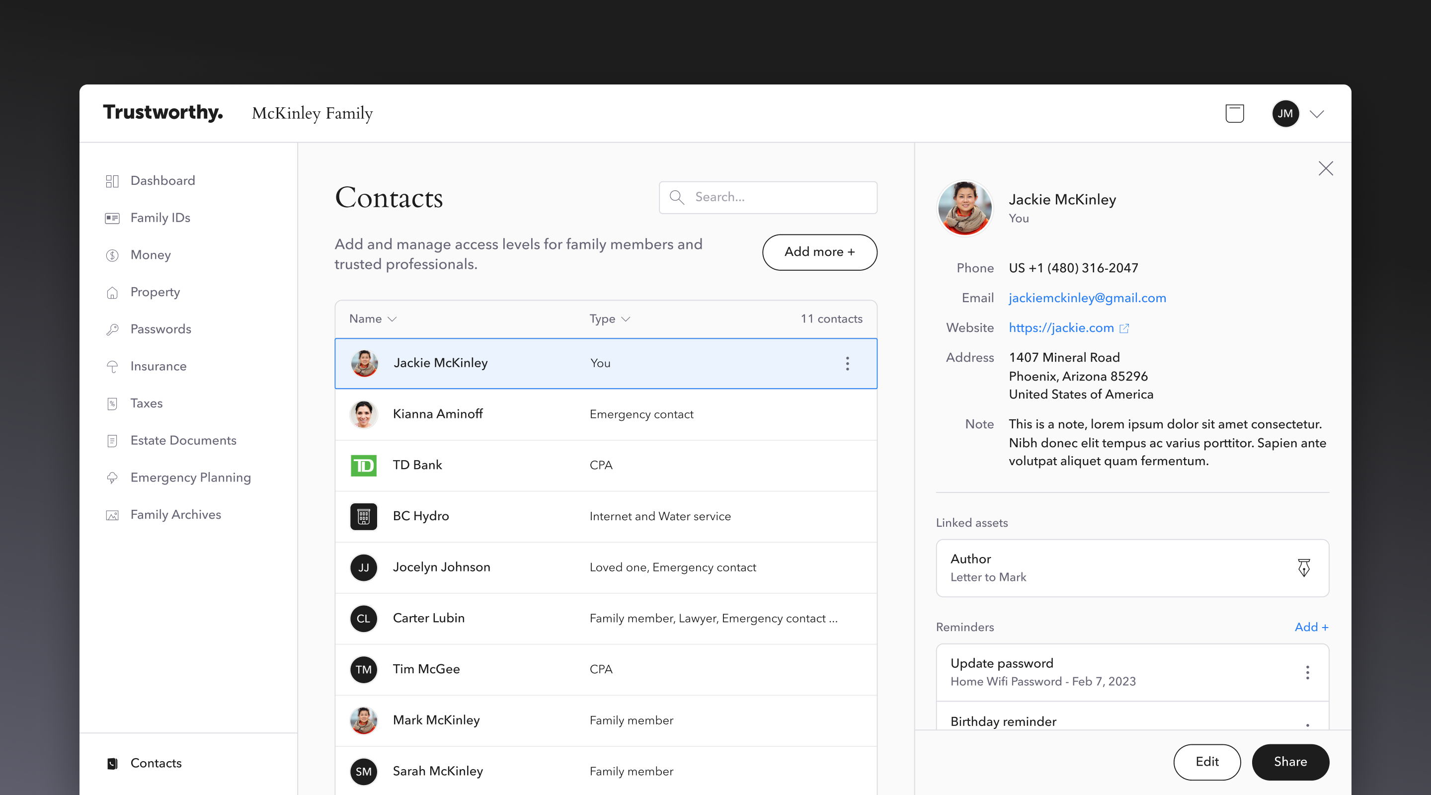
Contacts on Desktop
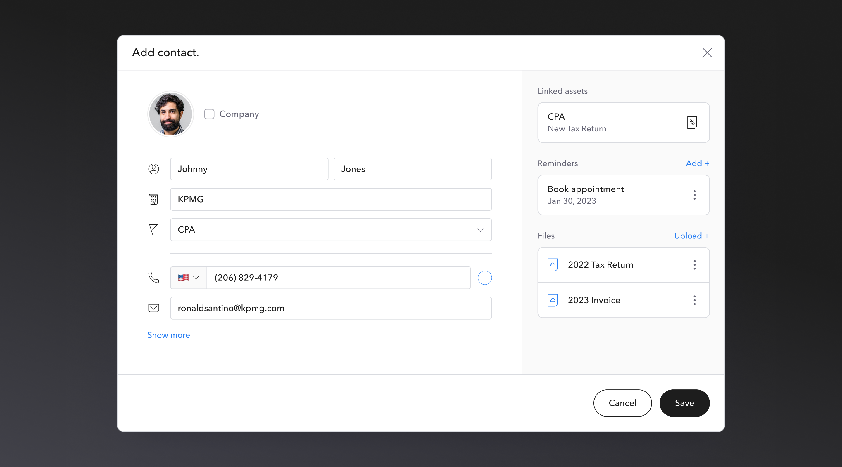
'Add contact' modal
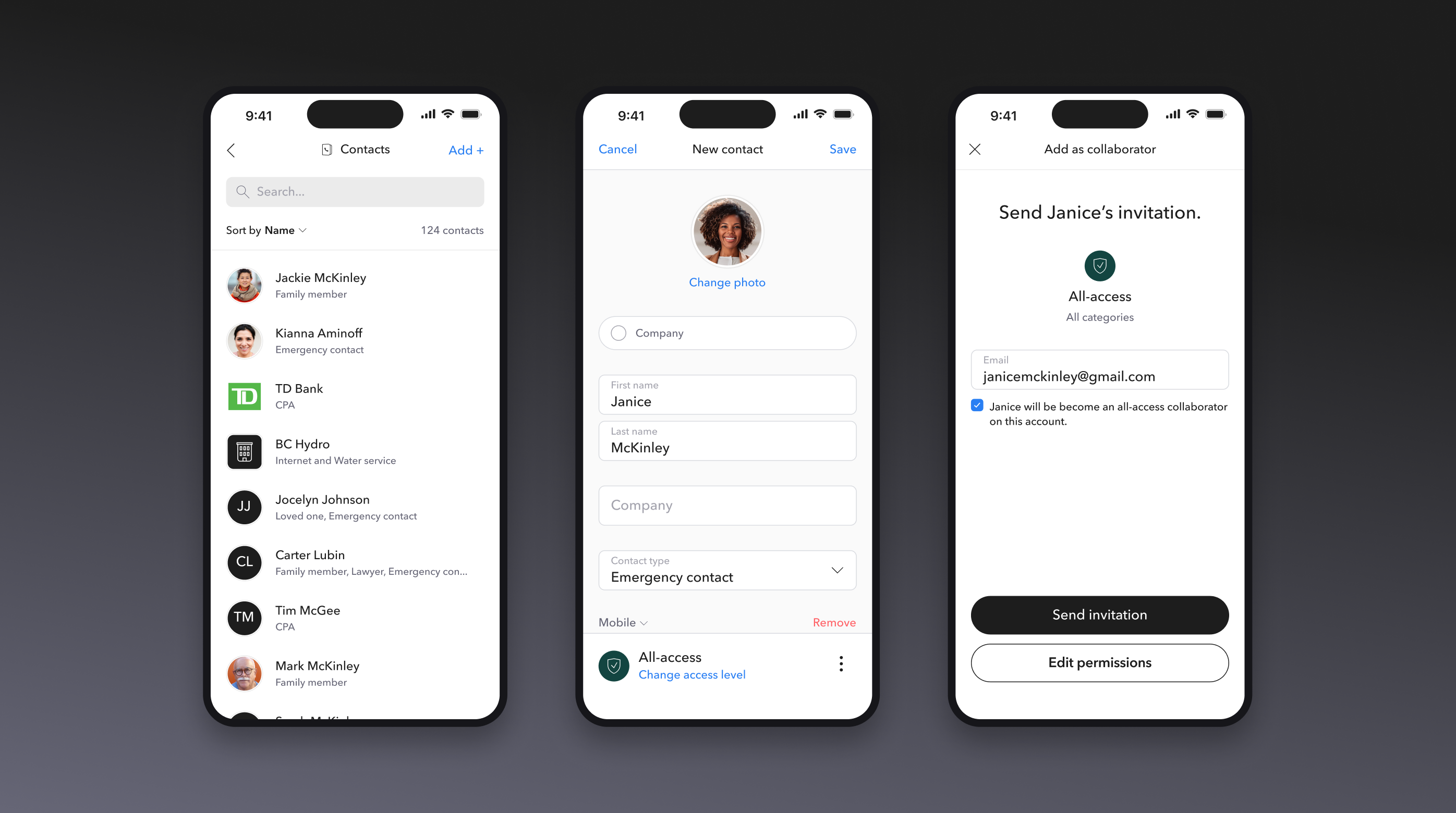
Contacts on iOS
List View (New Feature)
The original UI only offered a grid view that displayed items in a 3-column grid, which proved to be cumbersome for users navigating through numerous assets within a single category.
To improve user experience and efficiency, I designed a list view to offer a new view option. I also implemented a feature enabling users to toggle between these views and save their preference for a customized and streamlined browsing experience.
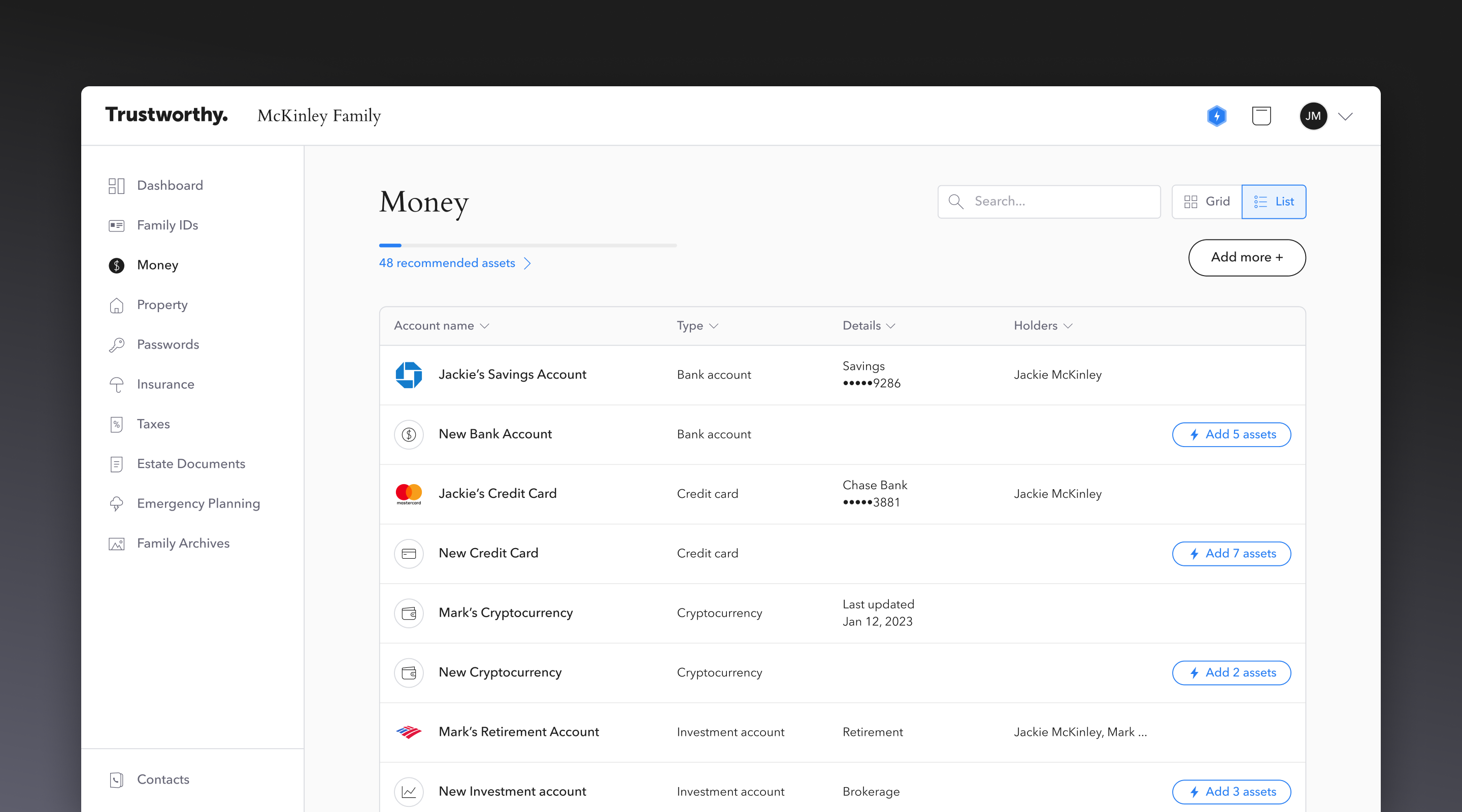
List view for each category page
Dashboard (UX/UI Update)
The previous Dashboard concealed important information, such as reminders and collaborators, below the viewport, so users were unable to glimpse what they needed to concern themselves with upon login.
To address this issue, I introduced a third column layout in the Dashboard to make key information accessible, while also polishing the UI.
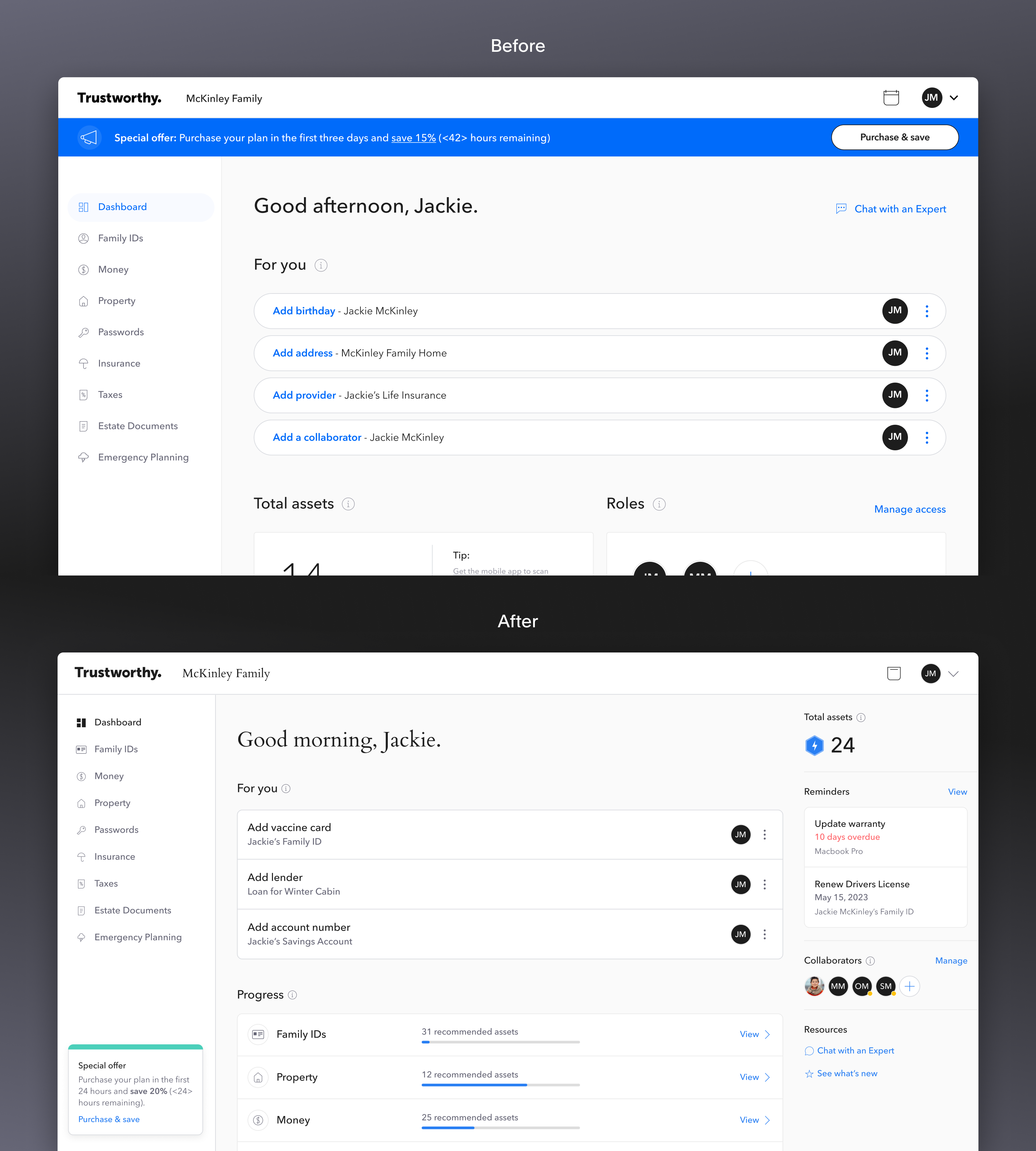
Before/After of the Dashboard UI
Assets & Reminders (UX/UI Update)
Assets and Reminders were previously contained within a popup window that was difficult to see and use. Thus, I turned them into side drawers, enabling a split view that doesn't get in the way of other content.
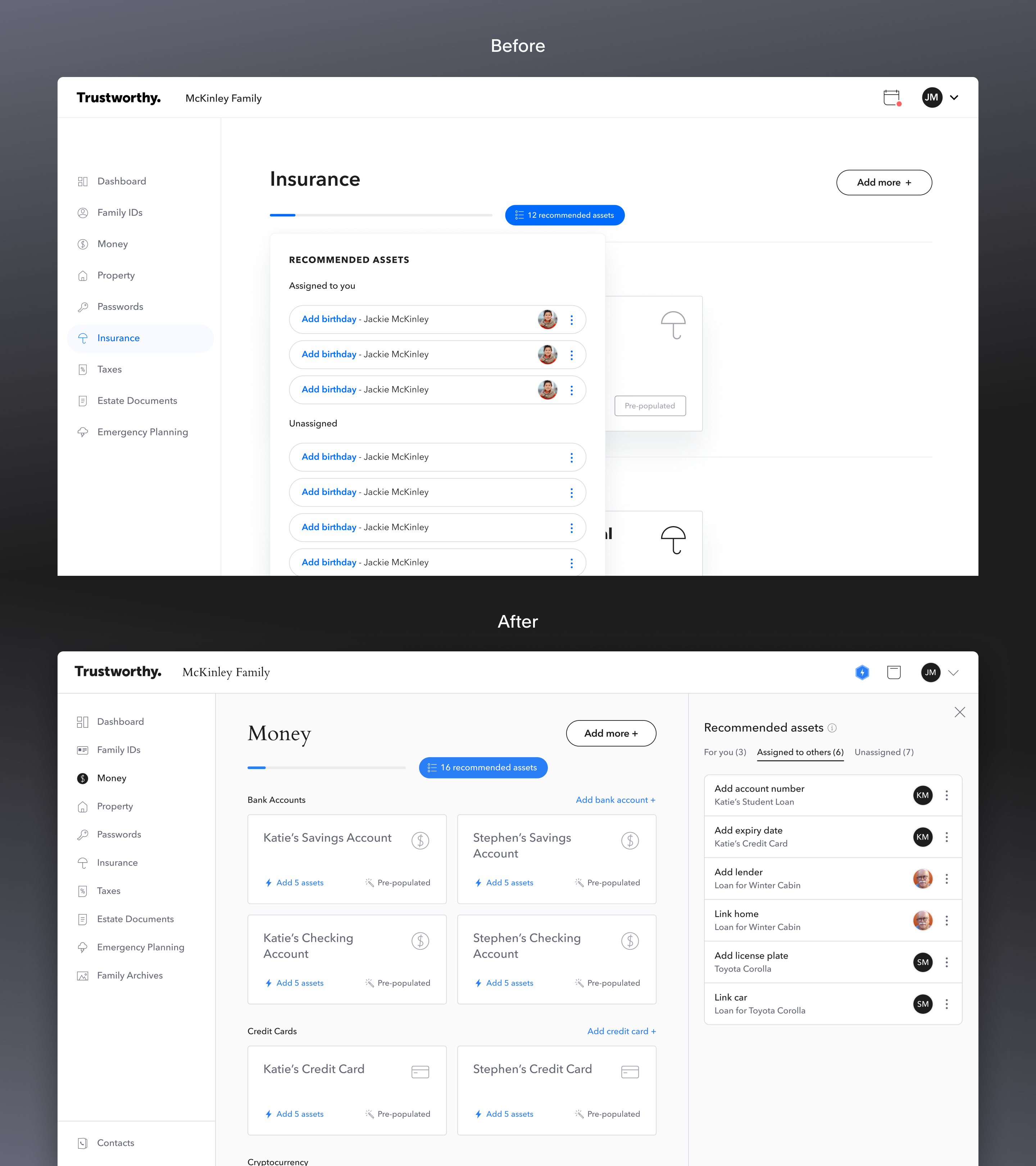
Before/After of 'Recommended assets'
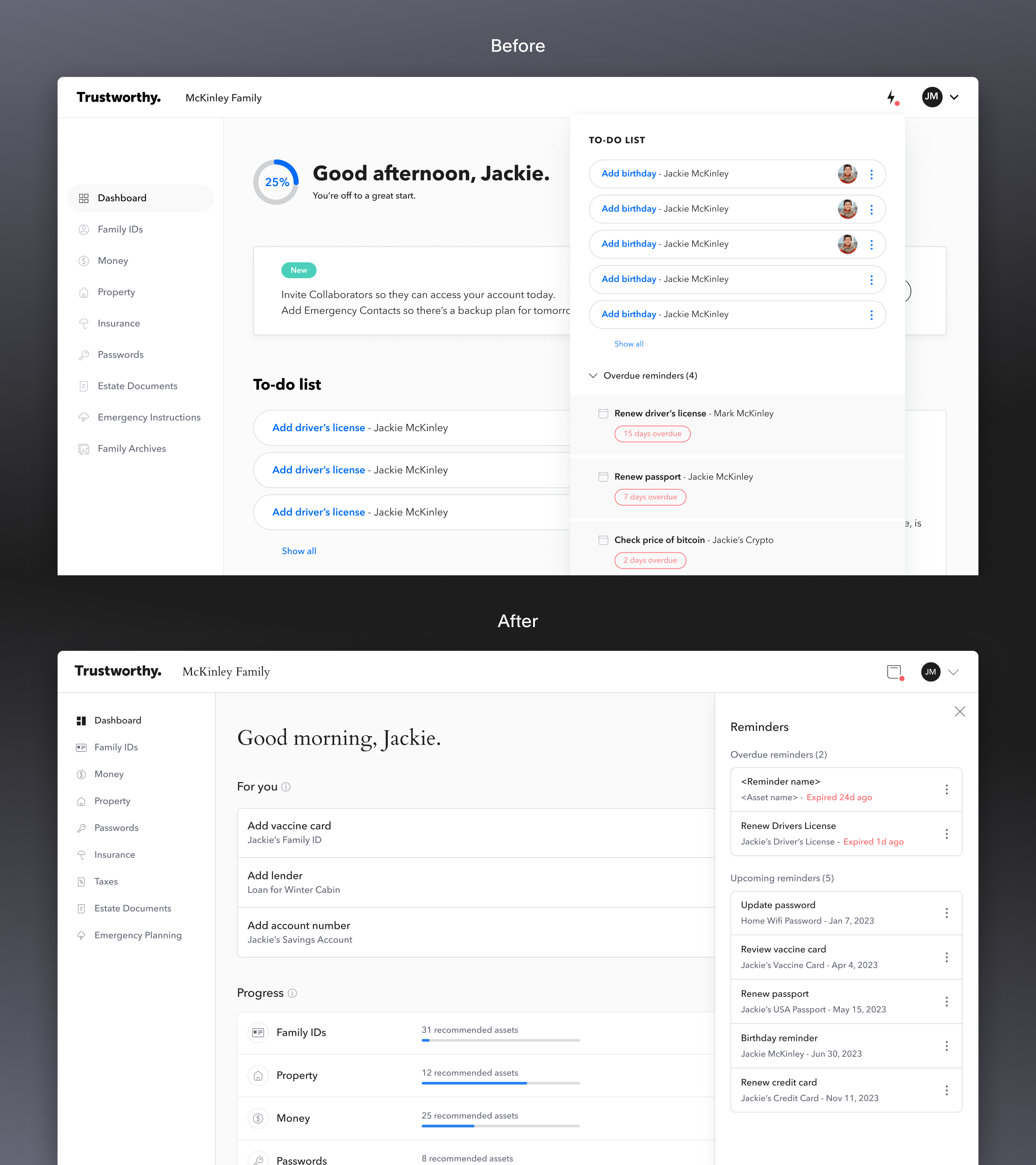
Before/After of 'Reminders'
New Feature Announcements
I designed the popup modals to announce new features to our customers. My intent was to dynamically visualize an abstract version of the feature while staying in line with the product's premium tone.
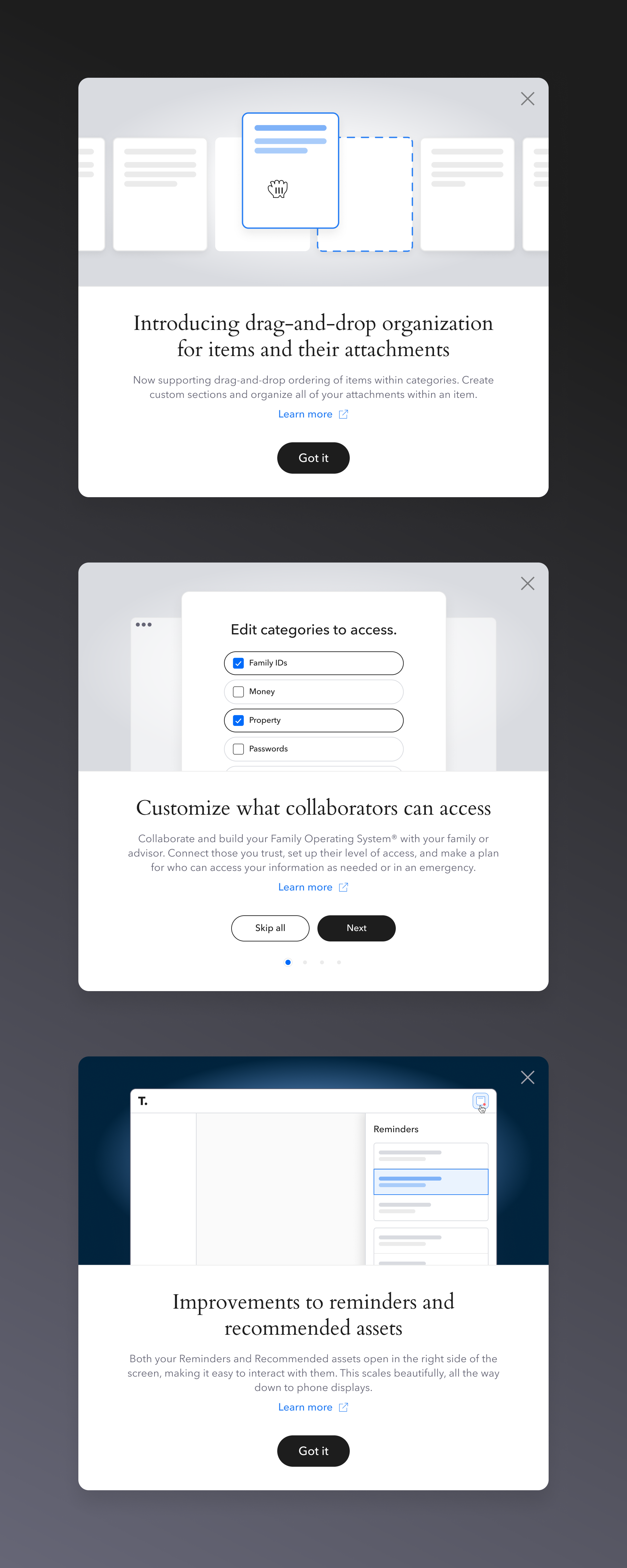
Product Update popup modals